Paper Cut:
• I created my silhouettes by using a cutting knife on plain white paper, placed on top of black card as a grounding so, that when it comes to scanning the images in and editing digitally, the Magic Wand tool can easily differentiate between where the positive ends and the negative begins without any pixelation or fuzziness.
• However, I am not the best at gluing and sticking due to my very low vision and made a less than stellar job of attaching the intricately cut paper onto the card! It developed creases, air bubbles and glue marks in the adhering process.
• Using the power of Photoshop, thanks to the workshops I attended recently, I was able to eradicate any imperfections using the Clone Stamp Tool and Spot Healing Brush, adjusting the Levels and Exposure to create more of a clearer contrast between light and dark areas.
• With the original measurements of the book, I created the base canvas I would be working on and made it a bright red colour to start with.
Creative Bloq:
• I recently came across a Facebook post from Creative Bloq, who made a texture resource post compiling free textures when creating 3D projects. Perfectly timed! They list sites such as Texturer, Texturemate, 3D Total, Marlin Studios and 3D Valley.
• This will be a great tool to keep note of for future module work!
• During the peer critique and feedback session on my book roughs, some of my samples were praised for having a "leathery" texture thanks to the acrylic paint and dry brush I used as a base colour.
• Because of these comments, I decided to look for a leather texture to lay on top of the red canvas to make it more visually interesting and allude to the idea of a vintage or antique book married with my childlike imagery.
Development:
• After using the magic wand tool and pasting the negatives onto my cover, I turned my paper cut pieces into layer masks so that I could remove parts of the work without affecting them permanently.
• Using the gouache brushes from Kyle Brush, that I purchased from the website for my editorial brief, I was able to create texture on my negative images using the eraser. I feel the second image works so much better than the first because of the visually appealing textures!
Typography:
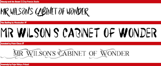
• Something I need to take into consideration is the font I will be implementing.
• I enjoy hand lettered / brush type fonts but feel I don't have enough time to experiment as much as I would like to.
I encountered a similar issue when creating my typology poster and reviewing the text to use in the title.
• Heading over to one of my favourite font websites I was able to download a copyright-free font that gives
the aesthetics of hand letting using a brush pen.
• One of the things that made my rough so popular among my peers was the way I had interplayed lettering into my negative pictures.
How do I translate this approach using a digital platform?
• I originally had the idea of tracing the font using my Wacom tablet, but instead used the Free Transform tool on each individual word - sometimes copying and pasting a single letter to individually tweak it in a certain way - to save time and create my finished piece to a more professional standard.
Final Outcome:
• Contextual research
• Roughs and thumbnails
• Louise Lockhart / The Printed Peanut-inspired process of paper cut and digital textures
• Strong composition
• Simple shapes, forms and motifs
• Negative images
• Colour palette of red, black and gold alluding to magic, mystery, wonder
• Time management
• Reflection and evaluation throughout the brief
Improvements:
• Without time constraints of only 2 weeks, I would have liked to experiment more with hand lettering and creating my own personal font.
• As my collection builds up, I hope to have access to my own library of textures and papers rather than using copyright-free sites online.
• Another constraint was the process; once again the print room was off-limits. I would be interested to see how this cover would have turned out if it were to be screen printed or even put through a risograph. Iteration of scanning or photocopying could eventually provide the same effect, giving a reduced look over scans, but that is rather time consuming for such a small brief.
• Instead of gold gel pen, I could have used the foiling machine but this is located in the off-limits print room.


No comments:
Post a Comment