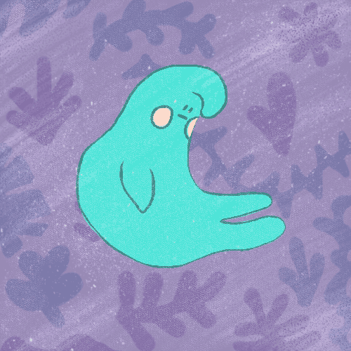
Friday, 17 February 2017

Visual Communication: Studio Brief 1 - Final GIF Set

Hand Drawn GIF


Successes:
• The texture from the acrylic paint really gives it a charm and nostalgic feeling for characters like Mr. Men and Little Miss back in the '70s.
• The flow of the 14 frames to create a loop
Correct dimensions
Simple colours and forms to tell the story
Persevering with the light box!

What could be improved:
Optimisation. Trying to downsize the GIF any further created an unsightly grainy effect and colour banding that I didn't want, so I tried to retain as much of the quality as possible with a reduced file size - which was a huge struggle!
• Adding a background to give coherency to the whole GIF series, but the prospect of drawing the background 14 times was not a pleasant thought!


Digital GIF


Successes:
Smooth transition through frames in the loop giving an effortless sense of movement.
Weathered background with gouache and dusty textures.
• Strong, vibrant colours.
• The focus being on Mr. Squidge with a nice balance of the background being subtle. I made the right decision to set the leaves to overlay rather than them battling it out for the spotlight.

What could be improved: 
Optimisation. This GIF fared better than the others as it was created digitally, rather than having photographs taken and uploaded or drawings scanned in, but it is still something that needs to be worked on.


Three Dimensional GIF

Successes:
• This is by far my favourite of the three GIFs I made and had a lot to do with the crafting and creating of it! It was a lot of fun to make!
• Using recycled clay and painting with acrylic paints has worked really well to translate the illustration from paper to a tangible form. It has a lot to do with using the same acrylic paints and colours to describe my character's appearance in a simplistic way.
• The stop-motion effect, not having a smooth transition gives it a 'clunky' quirkiness.

What could be improved:
• I would like to have experimented with building the set differently and manipulating the lighting so the true colours of the paper background showed through - but couldn't due to time constraints.
• Again, optimisation is something that I had to wrestle with a lot in order to keep as much image quality as possible.


Going back to my original post where I was extremely apprehensive towards creating a set of GIFs - I did it! It was hard work but I did it. I created a character that I genuinely love and people responded well to and found my hand-drawn and three dimensional more effective than the digital version - which was the easiest and most convenient to do. None of them are perfect and improvements could most certainly be made in terms of file size and making them flow better, but I think they all work very well as a group and I am very proud of the work I have achieved in just 2 weeks. Being able to experiment and explore independently was a huge part of my success and something I will be aiming for in the next 2 briefs. I always enjoy a playful approach to work using simple colours and shapes.

Thursday, 16 February 2017

Visual Communication: Studio Brief 1 - 3D Lens Development and GIF Test


The 3D GIF has been my absolute favourite to craft! I've really enjoyed the tactile element of making my character out of recycled clay from the ceramics workshop (yay sustainability!), translating him from sketchbook page to three dimensional reality. I naturally have very warm hands so the clay was easily mouldable and effortless to pull bits off and add bits on to get him just right. Air drying Mr. Squidge naturally did add an extra day to the production of my GIF, but I didn't want to fire or glaze him, adding a sense of vulnerability and fragility, incase he cracked. I had already spent some time making sure he represented the drawn version, and didn't want to make 3 models again because of the firing process going wrong! I painted him with 3 coats of acrylic paint to make sure all 

I wrestled with the idea of crocheting my character or using cut paper, but these are processes I am now very familiar with and wanted to push myself in the direction of model making which is still very new to me. The background was made with cut paper in a very freeform manner to translate the funky jungle from the digital version to balance out Mr. Squidge's 3D qualities. I really like the opposing senses of harmony and playfulness in the background, which contrast with Mr. Squidge who is quite a downtrodden character± I think he has been rendered successfully and model-making is something I want to consider more as I continue to experiment and test ideas as an illustrator.


One drawback is that it was difficult to balance Mr. Squidge while he moves between the 3 versions of model. When creating him I didn't know whether to film him on his side or while he was sat up... His side was easier but his figures rocked around a little bit and I had to eliminate a lot of frames where my hand or shadow were present; giving it a bit of a clunky, lo-fi, stop-motion effect. I didn't like this at first as I wanted the transition to be as smooth as possible as in my other GIFs, but accepted the outcome and find it has a unique quality to it. 

Test GIFs


From the demonstration it was explained that using a HD camera may cause banding and dithering when the images are optimised, so decided to use the image burst feature on my phone instead - so that no quality would be lost. It needed cropping from landscape to square dimensions which was tricky as I didn't want to lose any of Mr. Squidge's body parts in the process!

I couldn't decide between a GIF more more or less frames telling the story and had to make the decision to go with the smaller amount of frames for a smaller file size. The story is still the same but the transition isn't as smooth and results in a more stop-motion aesthetic.

Wednesday, 15 February 2017

Visual Communication: Studio Brief 1 - Drawn GIF Development

Hand drawing each of the 14 frames of my GIF is hands down one of the hardest things I've ever had to do! It is so hard to gauge whether it's going to look right or not until the frames are scanned in and placed together in Photoshop. If it isn't right, more frames need to be redrawn and scanned in again! SO TIME CONSUMING!

I'm not the biggest fan of scanning either, as images need cleaning up due to the pen and paint marks on the scanning screen. Each drawing also had to be manually enhanced in colour levels, hue and saturation and have any marks taken out with the clone stamp tool. Again, time consuming! When planned right and executed well the outcome can look great, so the challenge and hard work is certainly worth it... I had a little bit of an identity crisis as I was doing this long-winded process, feeling more like a Disney animator than an illustration student!

Drawing on the light box is such a challenge for me and I had to take regular breaks after drawing between one or two frames because of the amount of light being emitted. It was flooding my field of vision and giving me eye strain and headaches. This can happen on the computer too, but at least I can lower the brightness and type with my eyes shut! As good as I am at facing challenges with a tiny amount of sight (cooking, cleaning, walking in a familiar location, playing an instrument...) I can't draw in the dark! I persevered though and came to get used to the routine I was undertaking.

Despite the setbacks of my vision, using a light box, manually scanning and cleaning up, the GIF works really well in the end, didn't present any major challenges, and looks like an old-fashioned cartoon - which I LOVE! I much prefer this outcome to the digital because of the time, crafting and labour of love I had invested in the development and process. It isn't particularly perfect either, whereas the digital GIF has a smoother transition, and the imperfections and slight clunkiness give it a hand-made charm.

Tuesday, 14 February 2017

Visual Communication: Studio Brief 1 - Digital GIF Development

I found the process of drawing on my Wacom tablet and tracing over the previous frame, as I would have done with the light box, much easier and less time consuming than drawing in an analogue fashion. Construction lines can be erased quickly and any imperfections can be corrected in seconds. It was so beneficial to have tools at my disposal such as rotate and transform to move Mr. Squidge how I wanted to with ease to adapt him to the the storyboard I was working with. Moving him too much made his outline pixelated though, as the process went on, which meant I had to go through each of the frames and redraw his outlines. Ack! This added more time than I would have liked but ensured that his transition through the frames was smoother; looking more professional in the end. Working digitally also enabled me to get the pixel proportions, colour mode and resolution right at the beginning.

Another thing I found much easier was that I could just use the colour picker tool to capture the colours from my hand-drawn GIF, rather than having to paint each and every frame and ensuring the shade is accurate to the previous drawing. Creating my GIF digitally was the most easiest approach in terms of time constraints, accuracy and freedom of translation but it wasn't necessarily the most fun to produce as it didn't present me with too many challenges!


I wanted to have a fun background with my digital GIF that told the story of the funky jungle I pictured in my mind when listening to Weather Report. I tried to pick muted pastels so that they didn't wrestle with Mr. Squidge for attention and the main focus is on him and his mishaps. I found the colours didn't work too well alongside such a bright character, so changed the level to Overlay to make the jungle more subtle.

Again something was missing and I looked back to Lilli Carré's work with her amazing textures. I lightly erased some of the background away with a gouache brush from Kyle Brush and added a dusty texture I created in the Visual Narratives module set to 'Screen'. This gave the GIF a more distressed, aged look which I enjoy a lot, informed by my picture book research and development, providing connotations of the past to match the song as it was released in the early '80s.

Tuesday, 7 February 2017

Visual Language: Colour, Value and Notan

[The mind-bending world of colouring your pictures...]

Colour is important!
Value relates to the chroma, saturation, purity or intensity of any given colour.
Notan is a Japanese concept of how light and dark within an image can create harmony, dynamism or beauty. Notan formalises similar principles of value in the composition of artwork.
• Learn through play - making is learning
• Colour palettes are based on the principles of colour theory
• Within a palette, colours may contrast, accent, compliment, harmonise, or vary. Simple palettes are often the most dynamic, as I found first-hand through my visual skills and visual narratives work. Overcomplicating colours and elements do not make an image any more successful; intact, they can be harder to read and understand.

• What role does value play in planning composition?
The overall value, or key, will give the picture a certain mood. This can be used deliberately to portray a light, happy mood or darker, somber mood. Contrasting values can be effective for a violent scene. Important elements can contrast greatly (dark against light or vice versa) to become the focal point and less important items can be played down by grouping them together by their similar value.

• How can we use values to focus attention on certain information?
The greatest contrast of values can lead our eye to a certain focal point. Objects become more conspicuous when placed to a value that contrasts with it - dark against light, light against dark. Having many similar items together in together near each other will make them less conspicuous and therefor less attention-grabbing.

• According to the handout, what are the most commonly used basic value plans? How many values does it recommend you use in a picture?
The most commonly used basic value plans include light against dark, dark against light, dark and halftone against light, and light and dark against half tone. Few simple values are recommended so as not to overcomplicate the image and confuse the viewer.

• As always, although this information is interesting, can it be challenged?
Of course! What is wrong with having many values to create great discord and commotion, unsettling the viewer? Why does a light key have to be assigned to a picnic? It could be in a low key to contrast to the scenery. What is wrong with inconsistent values in a picture? This may be a deliberate device by the illustrator.


Jeffrey Alan Love

This illustration was my favourite from the presentation for a variety of reasons. Firstly, the viewer very quickly understands how gigantic and powerful the dark character is just because of how much he fills the frame; cleverly cropped at this torso and midriff to show his loaded guns and strong, angular fingers enveloping them. Symmetry! I love a good bit of symmetry for balance and harmony. The eye is immediately drawn to the white figure / 'hero' because there is the most contrast between values - white set against black will alert the eye the most. The mob donned with pitchforks and weapons are more subtle as seen as in the distance because of how far back they are, scaled smaller and how the half-tone sits against the white of the page - not being as striking as white against black. The halftone glasses and badge of the sheriff sitting against the black are also secondary, subtle information. Details that aren't noticed at first, but tell the narrative the more the viewer explores the image. How they curve around the villain in a circular motion allows the eye to explore the whole illustration instead of getting lost out of the frame, drawing them back towards the dark shadowed baddie in the centre.

Practical Task: Fan Art Poster


My absolute favourite person in the world, in a non-ironic way, is Rick Astley. As soon as a fan poster was mentioned I knew it had to be based on him. Or peanut butter. Or both!? Here is the step-by-step process of creating my chosen composition from a range of initial ideas and roughs. I gave consideration to the frame, depth, viewpoint, line of sight, rule of thirds and potential hotspots on intersecting lines to draw the viewer in.

• Aesthetic: From the previous Visual Language sessions, which informed the process of my Pearly Kings & Queens picture book, I now really love simplified shapes and forms married with basic blocks of colour and a speckled dust texture on top to give a sense of nostalgia and charm. I gave my characters a cut paper aesthetic, without them actually being cut from paper, and think they turned out really well digitally.

• Colours: My peer and I chose one colour each, which coincidentally became complimentary colours of blue and orange; contrasting each other and opposite on the colour wheel.

• Frame: The frame crops the closest figures' bodies to bring the viewer closer to the action at the stage, as well as cropping the audience and background on both sides to show that they both keep expanding outwards. The picture is cropped directly at the edge of the spotlight on the right, again to bring us closer to the main attraction. I split the frame into 3 parts; a third for the audience, a third for Rick Astley's level, and the final smaller third for the ceiling. The ceiling is angled to the right to lead the eye back down towards the right side where Rick is performing. I placed information in intersecting hotspots including a fan's hand, the stage meeting the spotlight and the arch of one of the back doors.

• Depth: Figures directly in front of the audience are bigger, with audience members further out to the front of the stage becoming smaller. The audience proportions get slightly smaller as they shift out of the frame on the right-hand side, contrasting against the background getting smaller on the left-hand side on a perspective angle.

• Line of Sight: The viewpoint is that of an audience member, directly behind the crowd, who become smaller as they reach the front of the stage. The focal point, to the centre-right, is Mr. Rick Astley himself - helped by the contrasting values of light against dark and half-tone in the spotlight. The spotlight broadens downward to reach the circular stage which is overlapped by crowd members. The hands reach up to the doors in the background, which lead out of the frame to give a sense of distance and perspective. The eye doesn't stay too far out of the frame and is instantly drawn back to the figure of Rick Astley again. I chose a lined, retro, almost 'video-gamey' font to allude to the past and finish the composition to give something for the spotlight to reach up towards. The early 80s was all about a 'new world' with music, films and life becoming more technological and mechanic, with the home computer boom, businesses and enterprises expanding and people getting left behind in the musk of the '70s if they didn't go along with the glittering and shiny new aesthetic. The font's central alignment gives the viewer a sense of order and harmony. I didn't want to overlap too many elements and make the image too visually complicated.

• Value: I gave consideration for the figures in the front being darker representing a closeness and the background being a halftone, showing it is further away, with the main character enveloped by contrasting light against dark and halftone. However, using a screen print process made this redundant as my halftones became full blocks of colour which then took away from the depth I was attempting to create through varying value. My positives had to be edited so that the grey areas had to become black so that they would properly expose on the screen through the emulsion. I thought that grey tones would only allow a small amount of light through, thus giving a light blue and light orange background - but, unfortunately, screen print doesn't work that way!


Reflection
I'm not entirely happy with how my final screen prints have turned out - largely because of the final colours. They didn't represent the shades that I wanted when digitally painting my rough on screen, in my draft version, and were too bright and transparent. The orange overpowers the blue as it is more saturated and opaque, and the blue is far too light and transparent. To attempt to fix this, I went over one of my screen prints with a blue marker which only helped slightly. I do like the mark-making that was caused by the pen and think it gives my poster a bit of variety where the blocks of colour may have been monotonous. If I was to do this again (which I would love to at some stage) I would select different shades of the colours I chose - adding yellow to the orange to take out some of the burning saturation and toning it down, and adding black to the blue to give it a more opaque and darker finish - in attempt to tackle the colour issues. Also, the white outline around the font only seemed to work on the blue layer so I would need to address this in my positives and tweak the error.

Monday, 6 February 2017

Visual Communication: Studio Brief 1 - GIF Testing

Here it is, my first ever GIF! I wanted to emulate the basic layers that my tutor showed in the demonstration... so as not to overcomplicate things at this early stage. I didn't even know Photoshop could create GIFs - so colour me pleasantly surprised! I've been using the software for 12 years and can still be blown away by the tools it provides.

After creating this basic animation of Tami I'm feeling a lot more optimistic about this brief now. Initially I was rather worried but using simple features such as Tween and copying, pasting and reversing frames to give a sense of coherency help reduce the work load. I'm rather excited to get started now!

The hand drawn GIF is going to pose the biggest problem as I struggle to use a light box with my little vision in one eye so I will have to tackle that one first to give myself enough time to make sure I get it completed and to a good standard.


GIF Research

Matt Wilson | Gemma Correll

 Lilli Carré | James Curran

After doing some basic research into GIFs by illustrators I follow on Twitter and through editorial works, I really enjoy the simplicity of these GIFs by Matt Wilson, Gemma Correll, Lilli Carré and James Curran (SlimJim Studios). Everything from the basic shapes, colours, and animated elements make these easy to follow without being too overthought or complex. They each have an individual charm and the reduced shapes and forms help to push that forward. The digital ones have a smoothness in the looping of the frames making them seamless... This is something I want to be able to achieve in my own GIFs. I especially love the textures and morphing shapes of Lilli Carré's GIF - showing that even looped images that aren't exactly smooth in transition can work just as well and give visual interest!

Sunday, 5 February 2017

Visual Communication: Studio Brief 1 - Continued Development

Going back through my sketchbook, I'm quite intrigued by this little guy and feel like he has something to say and something to convey. I like the fluidity of his shape which will make him easy to animate in motion for my GIFs. I think there is room for development so will experiment with his shape, colour and texture more to find the perfect fir for the song I have chosen!


I experimented with a range of media from dry watercolour, markers, paper cut, coloured pencil, cut mono print and thick acrylic to see which qualities and colours I enjoyed the most to represent the character's bewilderment and quirkiness.

Group Crit


I have to admit that I didn't find the group crit all too helpful... There wasn't any particular character that people seemed to respond to more than another and my peers' way of drawing didn't stray too far from how I originally sketched in my roughs, not furthering my initial ideas. It was a fun session and I enjoyed looking at my others' characters and how their ideas had developed through their sketchbook - but, on the whole, I just wanted to get back to my own project so I could continue developing my character and storyboarding how I want the final GIF to look!

Next Steps
• Bring together final 5 characters
• Develop storyboards for each
• Choose a final character and storyboard
• Begin development on my first GIF

Saturday, 4 February 2017

Visual Communication: Studio Brief 1 - Final Characters and Storyboard

After going through my sketchbook and character development extensively, I have identified a new set of characters that I am happier with. They are much simpler in their shape and form, reduced from outfits and unnecessary details, which will make them easier to translate into 3 different mediums when it comes to GIF building. These characters also have an individual, quirky charm to them where each could stand alone and have a story to tell - whereas before. the Jungle Jazz band worked much better as a set.

I numbered my top 4 to give myself a preference of selection. I will need some feedback and critique from my peers to help me gravitate towards a final character solution for my GIF.

I'm pleased with my ability to no longer settle for the first idea, or even the first few ideas, and to keep pushing and iterating and trying new forms and techniques of character design (cut shapes, vague scribbles with dry ink to form outlines, wet media to make marks that form into characters) to get myself out of my comfort zone, find new systems of making and discover work that I am happy with that hasn't just been selected for convenience.

Storyboards


I really considered what Dom Kesterton had told me about having a simple action and a silly consequence so that people can easily understand the situation and have a laugh along the way. The good thing about creating a GIF is that is transcends language barriers and we can all identify a silly and quirky situation. With my chosen music being quite strange, I wanted to create an equally strange set of environments and situations. I have never done anything like this before and had a heap of fun coming up with weird scenarios:

- Jazzy Cat grooving so hard that she knocks a coconut out of a tree. It hits her in the head giving her a huge lump - but this pleases Jazzy. She is happy with her growth!
- Laurel Loris finding a random scarf, which then wraps itself around her like a snake.
- Button M. Room feeling lonely in the jungle but happening across a field of mushrooms! Unfortunately they are all dead and he is the last of his kind. Button M. Room has an existential crisis.
- Squishy being inspired to curl up by a strange shell plant in the jungle, finding he isn't very athletic and eventually falling down and questioning his decisions.
- Jeff finding some funky leaves, picking one out of the ground to keep, and floating away.

Friday, 3 February 2017

Visual Communication: Studio Brief 1 - Cartoon Modern


Cartoon Modern has been intrinsic in helping me to develop my character design for this module. The range and breadth of images and illustrative styles have allowed me to think beyond what I believe I know about character design (which isn't a lot, and is mostly informed by my favourite children's books!). It has helped me to realise a different approach to my initial sketches and incorporate the modernist Cubist style - which coincidentally links wonderfully with the aesthetic of jazz music that I can hopefully portray in my character. Perhaps? Perhaps not? But it's a starting point!

There were lots of lovely quotes throughout the book that really got the cogs and gears in my head turning... "Use the language of animation to convey contemporary ideas and themes." "New mature brand of animated film." "Bold visual styles derived from modern arts, adapting principals of Cubism, Surrealism and Expressionism expanding and redefining the art form." "Walt Disney believes that character design should be 'live, individual personalities - not just animated drawings." and so on. Here are some of my favourite illustrations from the book:

Petroushka (1956) and The Old Man and the Flower (1962)

Saul Bass: IBM Commercial and Sun Detergent Commercialand John Hubley: unidentified commercial directed and designed by Hubley


The Hope that Jack Built (1957) and Walt Disney: Model sheet for Mickey Mouse and Trix Cereal Commercial