Monday, 10 August 2020

LAUIL504: Redoing this module

I am greatly displeased at the outcome of the work I've created during this module. My personal life has got in the way, along with self-isolating, and illustrating for a children's book became a huge barrier in itself as undertaking this competition brief has taught me that children's book illustration no longer aligns with my interests. It's no longer something I'm genuinely interested in, like I was in Access  to HE and Level 4, as I've greatly changed as a person by life's trauma and my mental illness. Children's book are no longer a comfort. I tried to rekindle a fire with this module that has truly burnt out.

If I was to do this module again, which I would love to do, I would choose the Secret 7 competition brief and produce a record sleeve for the Foo Fighters song that is available to illustrate for on there. Vinyl has become a great interest of mine so I have plenty of sleeves to contextualise and draw inspiration from. I would look to the Death Metal scene and the printed ephemera surrounding it, created by musicians themselves, to share with a small, niche audience.

Artist Research: Tobias Forge

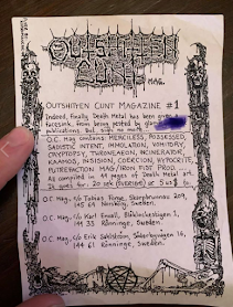
"Outshitten Cunt" zine, issue 1

Tobias Forge is Ghost's frontman and "mastermind" - writing all the music, playing the instruments in the studio recordings and deciding stylistically where he wants to direct his project and how he wants everything to look from merchandise to stage shows. I've already made a post about Ghost on my PP blog and the parodying of Catholicism, but I want to look at Tobias' younger days and his connection to the Death Metal scene in Sweden where he is from.

• Like punk, death metal is a counter-culture / subculture, focusing on the rejection of religion (particularly Christianity and Catholicism), choosing to use imagery of the devil / satan, pentagrams, decrying bodies, skeletons, and foul language to provoke. Death Metal scenes are prevalent in Scandinavian countries like Norway, Finland and Sweden where the Church has a lot of power.

In his youth, Forge was a part of a number of Death metal projects including Superior and Repugnant, where he designed the logos and printed ephemera himself.

• Designing band logos: Each band is easily recognisable by a symbol, an emblem, that can easily be applied to a variety of media. It usually involves a shape or type stylised into a shape which can then be turned into a patch for fans' battle jackets where they display their favourite bands proudly. Forge designed the Ghost logo too. He tends to sketch out the idea using an ink pen before adding shapes and symbols to the lettering to define it.

 • Designing death metal zines. Aura of the hand-made, analogue, lo-fi. Cut, collaged and photocopied together. Black and white, cheap coloured paper. Quick process to produce a large quantity and reach a large audience within a scene to give contact details and band news.


• Zines contain record and gig reviews, information about the band and the members, news updates and contact information to reach the right people

• Tape trading and cassette design - easy to hand out at shows and build a network of connections. Lo-fi and cost effective

• How is this relevant to me and my practice? I've started to enjoy death metal, metal and the subculture surrounding it these past few years and I'm greatly interested in the ephemera created and shared with an audience. I like the element of the hand made, the crafting process, the conservation of constraints and dimensions, and see these as art pieces in themselves.

• As someone who has been letting go of the idea of perfect outcomes these past few years, the distressed and grungy visuals appeal to me ad give these pieces an element of authenticity and ownership. I'd like to create work like this in my practice.

--

If I were to do Studio Brief 2 again, which I would love as I have created no outcomes during a difficult time, I would like to draw up a proposal focusing on mental health and suicide and the idea I have to creat a series of self care cards to use when you are most at risk.

• Self Care cards (creating 6 for the desired number for this brief) to use when feeling suicidal. Shuffle the deck and pick a card to help comfort you during a traumatic time.

Things that have helped me when I feel severely depressed and I can illustrate on the cards:

- Take a shower / perform a self care ritual

- Change your bedding

- Light a candle

- Listen to your favourite song / album

- Reach out to a friend or family member

- Hug your pet

I would look at what exists already in the market and whether this idea is unique. I would look at different decks of tarot cards to help me to understand applied illustration to a small square or rectangle nd how best to use the composition. 

• I would draw from my own experiences 

Personal Post

 I haven't produced as much work as I would have liked to, 'm admittedly disappointed in myself, and I want to provide a little bit of context as to what has happened to me since March when the Coronavirus started to become a bigger issue in the world and lockdown was enforced in the UK.

To start with, my grandad passed away during the exact time which brought up some terrible and traumatic things from the past for me which resulted in me reaching out to undertake counselling from university over Zoom calls. My best friend from childhood took her life not soon after and left behind her little son, and I had to take self-isolating extremely seriously as someone with severe asthma and a compromised immune system. I've worked very hard these past few years to be self-sufficient and independent with my Guide Dog and suddenly this was taken away from me. I no longer had my freedom, stuck inside the same 4 walls of my student accommodation, and could not work my dog; something which was extremely challenging at first as she was used to being so active. A lot of residents / students went home at this time to be with their families and I had nowhere to go back to. My mum is at home who had a severe stroke 2 years ago and I would become her full-time carer if I went home - no work would get done at all. I struggled to get food and medication now I wasn't going out to get it myself, with delivery slot priorities going to the elderly and not including the disabled. My eating disorder reared its ugly head and I was off my antidepressants until Shelly in Student Welfare reached out and helped me to put things in place. Motivation was extremely low and I was feeling the effects of extreme isolation from being on my own with no family or friends in Leeds. My mental health quickly deteriorated and my antidepressant dosage was increased.

During my second extension in early June, with the deadline of August 10th, I was suffering with very severe migraines that felt like ht lava being poured into my brain and eyes. On June 11th, this resulted in further loss of my sight in my left eye (all peripheral vision gone and a lot of light perception gone). Visiting A&E and an Eye Specialist didn't provide a reason as to why this had happened to me, leaving me confused, upset, and grieving for what I'd lost. It's been extremely hard to adjust to what I have left and I'm deeply unhappy that it still hasn't come back and probably never will. My grandma passed away last week on August 1st,, the wife of the grandad I lost only a few months ago, which leaves me in a state of grievance again and feeling so awful for my dad who has lost both of his parents in the space of just 3 months.

Everything has weighed so heavy on me. I'm bearing everything on my own and still trying to do my degree with less sight now than I ever have had in my life and really terrible mental health. I just want my mum back and it's not going to happen. I have no one. I have seriously considered suicide twice this past month to get away from the constant pain and loneliness I feel as I really don't see this getting better for me. 

I just wanted to share this because I know I look like a useless student but I'm truly trying my best with the very little I have.

Wednesday, 18 March 2020

LAUIL504: Studio Brief 2 - Covid-19

 As outlined in my proposal, I wanted to visit the Leeds Museum and Tropical World to build up a strong source of primary research to sketch from and develop my ideas with flora and fauna. Covid-19 has now nipped these plans in the bud as it becomes an increasing concern across the world and these facilities are due to close immediately. 

This is creating further barriers to a brief I am absolutely not enjoying and finding hard to tackle because of my growing disinterest in the subject matter. The thought of illustrating full page spreads is not particularly filling me with glee at the moment and I'm really struggling with my mental health. :(

Friday, 28 February 2020

LAUIL504: Studio Brief 2 - Contextual Research Jun Cen


Jun Cen's Soothing Illustrations Explore Loneliness in the Modern Era

While looking into other illustrators who may have focussed on themes of loneliness, depression and mental illness I came across this great article from It's Nice That showcasing Jun Cen's illustrations.

Jun Cen is an established Chinese illustrator with a background in printmaking currently working in New York with clients such as The New York Times, The New Yorker, Wall Street Journal, Vogue and WeTransfer. He is known for his smooth and calming works internationally. He adopts an open mind to illustration because of his broad clients and audience and their culture taste.

From It's Nice That: It is the theme of loneliness in the modern era (which he also tends to experience) that regularly crops up in his work. In a world filled with hatred and bigotry, Jun goes on to say: "Even the words we use in both virtual and visual worlds sometimes become a mess of censorship to silence those who hold different opinions. When I feel frustrated or lonely, I feel more like an individual than any other time. So my recent work focuses on these moments of introspection."

Jun Cen: Silence

A very muted colour palette mostly of cold blue-grey and grey white. Only small areas of peach to offset but they are very muted so as not to cause a disturbance. The composition of this illustration is very clever. It is mostly symmetrical to create a sense of balance and peace. The shadows coming down from the ceiling invite the eye down into the bottle centre where the figure and window are. The focus of the brightest element is on the white vastness beyond the dark, faceless figure forcing the audience to stare into to beyond and the unknown for a long period of time feeling detached.

Jun Cen: Text Me

Aimlessly wandering around into cyberspace into a digital graph, the lonely figure has nothing behind them and nothing ahead of them. There is a sense of ebb and flow like being underwater and moving slowly and quietly like a ghost, a shadow. Muted colours again suggesting a feeling of being emotionally drained, exhausted, tired, staring into nothing. More green tones suggesting technology. 

Jun Cen: Text Me

Very cold and mostly muted colours on the fingers. The more saturated blue turning to black on the phone screen in a gradient makes this the focal point of the composition. The faceless figure turning away gives a coldness, an emptiness, a separation. No integration or interaction. The many layers of the internet? The hidden layers of a person behind the screen? Social media can be not very social at all and oftentimes extremely isolating and lonely, people can be the subjects of harassment or attacks.

LAUIL504: Studio Brief 2 - Proposal First Draft and Feedback

Proposal First Draft

For Illustration LAUIL504 Studio Brief 2, I am going to be continuing with the foundation of
work I created during Studio Brief 1 for the Carmelite Prize 2020 live brief, ran by Hachette
Children’s UK, illustrating Jeanne Willis’ children’s picture book text One and Only. I will be
making a 32-page picture book in the required dimensions (250mm x 250 mm) to illustrate
the narrative of a lonely bird of paradise who eventually finds a friend. This particular
outcome is most appropriate to the competition brief. My project is ambitious in that I have
never created a 32 page picture book before in under 10 weeks and it is particularly
challenging to my low level of vision.

I am especially interested in the themes of loneliness, identity, overcoming hardships, and
accepting our differences to build strong relationships with others. This is highly relevant to
the market and these times as social exclusion, difference and an ever-evolving diverse
society of people continues to grow and we need to learn to look past others’ differences
from an early age; whether that be of someone’s appearance, what they choose to wear
and how they choose to represent themselves, gender identification, religion, race,
disability, financial situation, emotional struggles, and so on. It is relevant to myself as an
emerging practitioner interested in illustrating children’s books, who stands apart from
other sighted illustrators, as I often feel that sense of exclusion in many areas of my life due
to my disability and mental illness. It is highly important for me to illustrate that loneliness
and longing I often feel. Children’s books are powerful tools to help children imbue valuable
morals at a young age and to be the one to lend a unique voice to this learning is impactful
to me and gives me a sense of purpose and responsibility. The aims and intentions of this
picture book are to challenge, to educate and to open up a conversation between children,
friends, carers, parents and teachers.

The initial research I have undertaken so far includes photography and observational
drawing of plants around my student accommodation to help build up the composition of
the rainforest based on real plants, contextual research on Henri Rousseau who often
painted rainforests with layers of hidden fruit and animals and a visit to Waterstones to see
what is available on the market already in children’s picture books and how my work can
situate within it. Further research I would like to conduct includes a visit to Leeds Museum
to learn more about rainforest plants and animals and a visit to Tropical World. Both trips
will enable me to build up a better sense of the rainforest environment in a genuine way for
my spreads while providing strong evidence of first hand research.

As I identified in the previous winners’ work of the Carmelite Prize, the panel of judges
prefer a digital approach to the outcomes for a more professional aesthetic, so I started
Studio Brief 1 by attending the Photoshop Brushes workshop and working digitally with a
Wacom tablet. I would like to learn how to use the Wacom Cintiq that are in the studios to
make the digital drawing process much easier and quicker, than using my Intuos, by drawing
directly onto the screen. I need to consider the text in my book, particularly on the front
cover of the title, and whether I want to create that by hand as with the success of my
Dracula font or with letterpress and woodblock letter printing workshops that I enjoyed
during my Agatha Christie brief. My book will be binded using the perfect binder method
which I have had an induction in. I will need to consider project management requirements,
time restrictions to the processes and workshop availability during this brief and plan my

time very carefully so as not to lose track. The digital print room will be important to the
printing of my final book so I will need to book ahead in good time.
The methodology I will employ for this project includes creating a series of observational
drawings from Leeds Museum and Tropical World, roughs, thumbnails and sketches of
spreads, character design using basic shapes and lines as a prompt, selecting a limited
colour palette, creating a font for the title One of Only, creating a dummy book to
understand how the final outcome will be, refining any changes based on the dummy book
before finally printing and binding the final picture book.

Feedback

• Clear, well informed, well structured
• Expand research into practitioners who explore themes of loneliness or challenging content for children
• Identify the specific target age range for the book; this will influence the aesthetic and type of text I will develop 
• Include relevant imagery, previous winners, relevant practitioners, thumbnails, process testing, images I've made.

Thursday, 27 February 2020

LAUIL504: Studio Brief 2 - Personal Illustrations about Loneliness and Mental Illness


Last summer I tackled the heavy subject of my own depression and turning them into visual metaphors, creating an editorial-style series of illustrations. This was challenging and therapeutic in equal measures. Am I saying too much or not enough in my illustrations? Which direction do I want them to go and how dark do I want to make them whilst still trying to retain my identity as an illustrator who loves telling stories where not all hope is lost?

Depression is often referred to as being "the deep blue sea," so I kept my colour palette simple with shades of blue, giving a cold atmosphere in the process. Compositionally and thematically I wanted to demonstrate the loneliness and isolation that depression gives the sufferer in metaphorical situations such as an uphill battle / struggle and drowning in too much emotion, along with more suffocating structures to represent feeling like a prisoner in one's own mind and feeling alone and defeated in a crowded space; the walls slowly closing in and people walking all over you forgetting that you exist. I added textures, rather than retaining solid colour and shape, to demonstrate the complexity and many layers to mental illness. It isn't just black and white and there is more underneath the surface of a person and their situation.


Contemporary editorial illustrators I used as inspiration for this project included Nick Rhodes (Switchopen) and Dadu Shin. Switchpen's White Lies concert poster has successful use of minimal colour palette of blue, black and white, cleverly moving the eye across the composition with colour contrasts to highlight focal components. Dadu Shin has a distinct minimalist approach to filling a canvas space where things still feel balanced despite the open space.

Reflecting on my work I consider it a personal achievement and accomplishment. A lot of thought and care went into making it with a genuine authenticity. 

I want to use these illustrations as a starting point and as a basis of contextual research for my One and Only picture book dealing with similar subject matter of a lonely bird of paradise who also suffers from isolation and exclusion. My own personal experiences can resonate very powerfully when illustrating the narrative and this is why the text is rather important to me. No one should feel alone when we are so surrounded by so many people but there are a variety of things that still cut us off in society.

Tuesday, 25 February 2020

LAUIL504: Studio Brief 2 - Contextual Research Dadu Shin

I found a series of editorial illustrations that Dadu Shin had created surrounding the subject of disability when I was making my own personal illustrations on depression last summer and needed some illustrators to help contextualise the work I was making. These editorial pieces really stuck with me, for the breadth of disabilities and stories being portrayed and the similar way they were all approached. I want to use these as a good foundation of contextual research for social exclusion and loneliness in my project to help with compositional and colour palette ideas when it comes to creating work for the One and Only picture book.

"If You're in a Wheelchair, Segregation Lives"

Dadu's illustration visualising Luticha Doucette's article for the New York Times depicting a black woman with incomplete quadriplegia and chronic pain and how her ability to move freely is severely impacted and frequently restricted. The social attitudes of ingrained ableism and ignorance and inaccessibility hinder her daily - something I deal with too. The colourless and featureless able-boded crowd is cleverly placed along her like a prison, a chain link fence of limbs, and she is trapped. The colours are muted and the most saturated are the woman herself, she is the focal point and this is her story. The sky graduates down bringing the eye down centrally to her where she is encased and unimpressed. The colours suggest the indifference of society when faced with a disabled person, not aware they are making a barrier of themselves. I face this issue everyday when walking about with Tami, my guide dog. Sighted people walking into us and not watching where they are going, too busy with their phone, standing on Tami's paws, walking into me and bashing me with shopping bags. It's exhausting and unwelcoming and makes me hate going out into the world.

"Passing My Disability onto My Children"

Dadu Shin created this powerful illustration in response to Shelia Black's essay openly exploring the pains of a mother passing hypophophatemia, a type of dwarfism, onto her children. Dadu's illustration depicts a family of three, all holding hands, in a busy crowd who are not. The visual language of the dots suggests their genes being the same and passed down while also being central and the focal point of the composition. The soft, blurry figures in the background created in coloured pencil do not have the same visual language as the family and are not the same height. The crowd have the same height and visual language however, with darker figures on the edges drawing the eye inwards back on the family. The warm colour palette is welcoming and friendly, the shapes are soft and there is no bold or harshness beyond the genes. It is almost dream-like.

"Becoming Disabled"
https://www.digitalartsonline.co.uk/features/illustration/dadu-shins-visual-narratives-of-disability-are-insightful-elegant/#1

Dadu's illustration for The New York Times was based on a series of features written by disabled people during the Rio de Janeiro 2016 Paralympics reviling raw truths about living with a disability and the societal treatment. The shadows and multi-layered textures marry isolation and acceptance. These are "honest, raw, authentic and moving pieces of opinion." Disability is everywhere. Warm colours paired with colder, shadows mixed with light. The image suggests a metamorphosis, a growth, a realisation and acceptance. We are all people inside just like the central, able-boded person. 

Monday, 10 February 2020

LAUIL504: Studio Brief 1 - Work so far


Here is my work so far in this brief. I'm really struggling with it and starting to lose time between the cross over of studio briefs 1 and 2. Children's books aren't holding my interests like they once did and this work is helping me to realise that. I associate children's books and my experiences with them, with happiness, family and comfort. I have none of those things any more and I'm starting to hate what I'm doing here. It's creating all kinds of artists' block and obstacles ad I'm finding it difficult to move forward. What do I do now? Do I keep pushing with this even though I'm struggling mentally and this is creating a barrier from me working?

Friday, 7 February 2020

LAUIL504: Studio Brief 1 - Contextual Research Henri Rousseau

Rousseau by Taschen

• Going back to the research session, instead of just composing research through the internet - I want to start using the facilities of the library more and using the breadth and expanse of our art books.
• Roussaeu was seen as an "amusing innocent" in the French art scene, "disregarding all the refinement of French painting and all the achievements of optical illusion." He paid no attention to the history of art nor showed an interest in experimentation, focusing only on the canvas itself.
• His peers were Van Gogh. Matisse, Gauguin, Signac for 25 years and he was seen as the odd one out. His art was seen as a joke and hung in bizarre places.
• Only when he died was his work appreciated and he was seen as a "gentle Douanier" and an eccentric.
• Drew chalk and pencil drawings in his spare "leisure" time along France observing wine, grain milk, salt, and spirits eig transported into the city gates. Simple, visible reality.
• 26 versions of his famous jungle theme were painted from 1904 - 1910. each progressing n composition and imagination.
fifty shades of green, many forms of eucalyptus, banana, sugar cane, fern, palm, cactus.
Characteristic collage style
• Multiplicity of viewpoints
• painted form photographs and traditional models
• His purpose was to show things as they were commonly perceived. informative, self taught artist.
• He hadn't picked up a paint brush until he was in his forties and hd a er naive way of painting  - a very simple and unassuming tone of voice
• hidden animals, many layers of plants to portray nature's bounty, a sun, bit of sky, mostly foliage to show how luscious the jungle is. • Oils on canvas showing texture, earthy tones but bright colours of a loud sun, flashes of animals attacking each other, splashes of fruit and flowers.


Book 2: Henri Rousseau - Jungles in Paris


Tuesday, 4 February 2020

LAUIL504: Studio Brief 1 - Initial Character Design


• Responding to images on google and using different methods and media to try and create some initial thoughts

• Cut paper shapes to be playful, inquisitive, move away from what a bird of paradise is to what it could be in an evocative way

• Final outcomes based on silly proportions, gumdrop knees and being shaped like a teardrop to symbolise and make connections to sadness, loneliness.