Saturday, 31 July 2021

[LAUIL603] Studio Brief 2: Zine Research and Considerations

• Contextualising a physical publication and zine - here are a number I picked up at various places back in my sighted years including Leeds Zine Fest 2016, Thought Bubble 2016, and Manchester Print Fair 2015.

• I want to give thought and consideration to publication/booklet/zine specifications. How many pages for a publication? What size is a "good" size?

Due to the pandemic and lockdown this will not be a printed publication. It will be digital, ut I need it to load quickly on the computer so a small size is still something to consider. If this were a printed publication I would want it to be something portable and handheld that people could easily transport and carry it. A pocket object. A5 seems an appropriate size. A5 dimensions are 148 x 210mm. I will work to 300 DPI for print if the opportunity arises though 72 is all that is needed for online - so the resolution will be above and beyond for an online publication. I want to remain considerate for print.

• How many pages should my publication be?


https://www.reddit.com/r/zines/comments/5vmutu/how_many_pages_for_your_average_zine/

https://www.etsy.com/forums_thread.php?thread_id=5843832

https://www.quora.com/How-long-should-a-zine-be

• Research on google is inconclusive in regards to the amount of pages for a zine or publication and has open discussion in regards to where to start. Publications/zines can have upwards of 80-100 pages though will need perfect binding/stitching and no longer have that DIY feel.

Conclusions: Anything goes! Whatever is relevant to what I am making. People agree on around 25 pages as an average? I think I will need to make a basic skeleton of the content and then create padding and add pages as and when, allowing room for any additional content that may seem appropriate.

• Issuu no longer seems to embed online publications for free - what else is available?

https://www.g2.com/products/issuu/competitors/alternatives

Conclusions: FlippingBook, LucidPress, Joomag, FlipSnack, Zeplin, there are a lot of alternatives! I will need to assess each one and make a decision on which one is accessible with my screenreader and meets my needs.


Consideration for contents:

Around 20 or 22 pages at a minimum to start - though will add more as and when I construct. 


Page 1: Cover and title

Page 2: Insert Pattern

Page 3: Opening context [Text On September 5th 2018, I started to experience a change in my vision... After a lot of rest, it wasn't going away and I needed medical attention. ]

Page 4: Instagram Post

Page 5: What is retinal detachment?

Page 6-9: The process of the curtain coming forward 

Page 10: Flashing lights

Page 11-12: Surgery 1

Page 13-14: Surgery 2

Page 15-16: Surgery 3

Page 17-18: Surgery 4

Page 21: Insert Pattern

Page 22: Back cover

Thoughts and Reflections:

I'm quite nervous to get started on the constructing and feel an immense pressure to do a good job of this. this project has significant personal value and I've been crafting the canvas paintings for quite some time. I do feel a sense of relief after conducting some research in regards to existing publications in my possession and parsing page count and dimension. 

Friday, 30 July 2021

[LAUIL603] Studio Brief 2: Collating Feedback through Instagram and Reflection

Reflection:

Throughout this entire module, I shared select pieces online through my professional art instagram with friends, professionals, and other people who found the work through the available clickable location and the hashtags I'd used. I curated the pieces I shared, comprising of both experimental monoprints and paintings, and more "complete" canvases.

It is important to note that none of the feedback I received in Instagram comments influenced my project or my canvas paintings in any way, or pushed my project forward in the same way a crit or tutor feedback would. However, value still exists in publishing the work into the world on an open forum, allowing me to process that the canvas or experimentation piece is done, shelve it, collect feedback, and move onto the next piece. This cycle was necessary at times to keep me moving through the project, keeping me on track with my goal of producing at least 2 canvas paintings per week as per my project proposal. Knowing an audience was waiting in the online sphere allowed me to produce more paintings than the necessary two. Sometimes I was painting one a day because of the lockdown from January to March and I craved something to do, the rush of endorphins of sharing my work with an audience, and interacting with people outside of my four walls. I have no friends or family here in Leeds and struggled immensely without my Guide Dog for 7 months. This became my social life. A connection when I was lonely during the pandemic while also allowing me to work through my degree and through my trauma and daily feeling that arose - also giving me feelings of calm and worthiness. Connecting with people is very valuable in itself.

It was an interesting journey over the months to observe which paintings people found visual value in through navigating which paintings had more overall interaction. I could analyse which paintings had more "dwell time" through my instagram analytics and insights. It made me consider and reflect on what makes an audience interact - is it the caption? The content itself? Longer captions of retrospective thoughts invited the audience to leave comments and share their perspectives. A vulnerable caption paired with a vulnerable painting... Certain quotes and poems resonated with the audience, too.

I was able to sell some of these paintings along the way because of sharing on instagram, increasing my professional skills in that aspect. 

Friday, 23 July 2021

[LAUIL603] Studio Brief 2: All Canvases and Reflection

Reflection:

I am extremely proud of the physical portfolio I have produced during this brief, comprising of 64 canvas paintings in total. I pushed myself to use different dimensions and shapes, experiment with different mediums (with or without gesso, structure gel, matte medium, gloss medium) to experiment and identify visual information and mark-making that is valuable to the project as a whole and answers my question -  how can I portray blindness? How can I warp the paint in different ways to take the viewer on a journey through my lens? Since the New Year, I have really pushed myself out of my comfort zone and tried to problem solve this using a variety of colours.

I worked during some very difficult personal circumstances which I could not be more proud of. The going got tough, and tough, and tougher and I persevered as much as humanly possible. By mid-March, I had reached 200 days without my Guide Dog, Tami, who had left me at the end of July 2021 to go to a boarder, have surgeries to remove the benign tumours on her hips and ribs as her harness could no longer close, and recover. She was fully recovered and healed by January 2021 but the lockdown prevented us from retraining and I was nervous going out into the world without being vaccinated yet. My mum was also struggling with the pandemic and isolation as a severe stroke survivor and it hurt me to try and complete my degree while hearing how much she was struggling and eventually hurting herself to cope. I started to lose steam in many ways. With the project and with living. It was so, so difficult living in the lockdown and not being able to go outside - depending on food deliveries and the online realm for my source of happiness and communication. By March, I was fully vaccinated but my barrier was my disability. I was missing Tami so much who is my family and my best friend. I don't really have anyone else with my mum not being my mum anymore and everyone in my family abandoning me with the responsibility of being her carer. It's a terribly difficult situation to live with everyday, and I will for the rest of my life, along with retinal detachment and losing my useful vision - which I'm trying to unpick in this project. To face the content of this project every day was also tough. Was I doing a good job? Was it worth doing? 

With the pockets of human contact, and familial love, not being fulfilled, I was struggling and falling into a dark place. Painting had been an escape and a therapy as talking therapy wasn't too successful this year especially finding the right person to talk to. Listening to music and painting as an escape holds much more value to me to work out my issues. Upon Tami's return at the end of March, I was able to pick myself back 

How have I improved as an artist? My professionalism with canvas painting authentically and organically improved over the months as I continued to paint and push myself, getting used to the materials and experimenting with what they could do - problem solving the question of how to portray what I can see and how to honestly and accurately convey what happened to me in a step-by-step process of flashing lights, large floaters, and a black curtain drawing across my vision before my retina detached. I know how to apply gesso and mediums to acrylics, such as matte medium, gloss medium and structure gel to achieve certain outcomes to a high standard.

I uploaded all of my work in real-time to continue to motivate myself which held incredible esteem. to collect feedback from friends, professionals and people on the internet, shelve the piece, and move onto the next one so that I could continue moving forward in the brief was such a valuable cycle. IF I didn't do this process I think I would have been stuck in my own self-doubt.

What could I have done better? I would have liked to try making my own canvas with the university facilities, rather than just using small, portable ones bought from Amazon that are cheap and easy to deliver. The lockdown until March prevented this from being a reality and I had to manage my time effectively to be able to complete my other modules of dissertation research, writing and planning the visual essay, and professional practice. I could also have tried using different paint, instead of acrylic and watercolour. but I don't feel ready to progress onto oils yet.

What next? Now that I have completed my set briefs of canvas painting and monoprinting, it is time to plan my publication and start to construct it. I want to ensure the content is interesting for sighted viewers while being educational and having good, visual quality.

Monday, 5 July 2021

[LAUIL603] Studio Brief 2: Collecting and Documenting Retinal Detachment

Personal Instagram:

 Google Drive of Camera Roll from the time:

Google Drive link: https://drive.google.com/drive/folders/1-FVJW-YkyYwBqPO0AxUDtD1dHRdCV3VM?usp=sharing

I documented my 6 month retinal detachment journey of the time, from September 2018 to March 2019, through selfies and photographs and shared my story to my personal instagram - originally sharing with friends and fans of my favourite band (Ghost) which spread a little further afield. Reflecting back, how could I have done things differently? I could have shared vlogs or lives to have kept those personal moments for the future but honestly, it was such a traumatic time for me and I was highly medicated while I was healing. It's very easily to say these things while I'm reflecting back, sat here and wishing I'd done them, but at the time it didn't feel right and I was very out of it. I do wish I would have done something other than visual media such as photos and selfies though. Some kind of voice recording would have been incredibly valuable. It's hard to imagine me not crying though. IT was such a horrible and lonely experience. Still, I documented my healing journey and these photos will go towards the creating of the publication. I have made all of my photographs "live" in a Google Drive link.


Trigger Warning for sensitive imagery of healing eyes

Wednesday, 30 June 2021

[LAUIL603] Studio Brief 2: Artist Research


1. Jackson Pollock

Jackson Pollock was a major figure in the abstract expressionist movement and it would be a huge oversight in my work for me not to include him. I went to his exhibition at Tate Liverpool in 2016, originally with the Access to HE course, and I went back on my own with my mum when she was well. They had an audio described tour and I took my time going around the space, learning about his life and how he crafted his practice. He made a huge impression on me back then even though our practices were different and my original desire was to become a children's book illustrator. I related to his personality of being reclusive and wanting to find escapism. He primarily used oils, aluminium and enamel paints on canvas and dripped to create a huge body of work that different in visual quality and texture. He used his whole body to create in a performative and immediate way known as action painting.

I'v chosen to revisit him because the pieces I selected from the two books in the library are very reminiscent on retinal detachment. The frantic black lines reaching across the visual field, embracing your entire world and engulfing it. The shapes shift and change and vary in line quality and he has captured it really well - even though his intention probably was not to portray retinal detachment and the floaters that occur before the flashing lights and black curtain pull across!

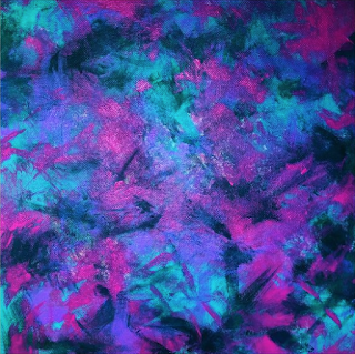
One particular piece, The Flame, I selected because it reminds me of my piece, Agony, where I used a palette knife, acrylic paint and structure gel to try and portray the pain of ocular migraines. We have both used a similar colour palette and a way of shaping and positioning the canvas to almost move and engage the audience.


2. Willem de Kooning

Willem de Kooning was another prominent figure in the abstract expressionist movement, or a movement known as "action painting," with his wife Elaine de Kooning. The two pieces I selected from the tome in the library stood out to me because of the harsh brush strokes which make the world look like its bleeding and melting together - not too dissimilar to retinal detachment and a blind lens. There is a sense of immediacy and urgency. The earthy tones are reminiscent of being outside with Tami as I'm travelling around Leeds and Yorkshire, doing my errands and needing assistance from sighted people or Google maps to orientate myself better. 

The second painting has a different visual quality - a sense of fractal and biomorphic shapes. I chose this piece as it was reminiscent of how I view people in my blind lens now. I can no longer see people are faces, just a general shadow or shape or colour, and this gives a perfect snapshot of that jumble of objects and how disorientating it can be to get a handle on a situation.


3. Sam Francis

Sam Francis was an American painter and printmaker who was originally influenced by abstract expressionist painters such as Rothko and Pollock, evident in his loose and gestural style. He became more interested in the expressive use of colour and later became more influenced by Zen Buddhism in particular. I chose Francis' piece Blue Black because it was immediately reminiscent of the overpowering black curtain that pulls across the vision as the retina is peeling away. the mark making and the use of contrasting colour make this piece very compelling and arresting.. The severity of the marks here is almost like a swarm of unbreakable floaters. Highly relevant to the work I am making.


4. Jay DeFeo

Abstract expressionist painting seems to still be largely a celebration of male painters of the time, and given the historical context of the early 20th century, makes sense that women's efforts were ignored or erased. I found a book that elevated the contributions of women which, of course, is relevant to myself and my practice as a practicing female painter. Jay DeFeo's work immediately stood out first as I was flipping through. She was prominent in the 1950's during the Beat movement of San Francisco. Using an experimental approach to visual vocabulary, she experiments with scale, colour, texture, and ambiguity. Untitled (Everest) captured me in the blunt marks and limited colour palette. There is a sense of falling downwards from the top of the canvas. It is very accurate of trying to see through a blind lens and make sense of objects but having the inability to because of damaged colour perception where everything is washed out, and a haze, blurriness and softness to environments. 


5. Judith Goodwin

Judith Goodwin was heavily influenced by Hans Hoffman. She utilises an emphasis on interpretation of experience and emotion through improvisational construction, combining the language of colour and gesture. This way of working heavily aligns with my own which is why I wanted to incorporate her into my artist research. She is of high relevance and important to my own practice. The two pieces I selected, while not directly explicit in their interpretation of the blind lens and the blind experience, have qualities that suggest it.The blocks of black and blue in the first painting are reminiscent of the large floaters and the black curtain that pulls across during the retinal detachment process, becoming a huge barrier in both the vision and eye health, and the faded strokes across the canvas are reminiscent of distortion and damage. How objects are sewn across the lens, in shards, when affected by light and shadow. The same is true of the second canvas painting. There is a huge sense of movement in the way the paint is pulled across in linear motions and has a similar appearance to a blind lens in bright light. The dark strokes are still present, alluding to the floaters and the damage done.

6. Vivian Springford

Vivian Springford was an abstract expressionist painter who became heavily influenced by Chinese Philosophy, calligraphy, Confucianism and Taoism as her practice shaped and developed. Her paintings were predominantly composed of calligraphic brushstrokes and coloured accents of dripping and splattering. I chose her Untitled painting from the book of female abstract expressionist painters as it immediately captivated me and reminded me of the second day I was experiencing retinal detachment, in the way the floaters were larger, softer and gliding across my vision like octopus legs. She has utilised soft and circular motions which contrast greatly against the splattered blue and black. It is gentle, foggy and misty. This painting holds great relevance to my project and my experience.

7. Joan Mitchell

Joan Mitchell was one of the few female abstract expressionist painters who achieved critical acclaim in her lifetime, recognised as a leading figure. Growing up, she was very active and enjoyed diving and skating and this sense of athleticism and high energy is reflected in her paintings. Her paintings are expansive often covering multiple panels. Landscape was the primary influence in her portfolio. She painted on unprimed canvas with gestural, violent brush strokes. The pieces I selected are relevant, again, the blindness and retinal detachment. The first piece is not too dissimilar to the floaters that built up in the final stages of retinal detachment, in a harsh and unmoving barrier, and the second painting is what it's like to view the world through a distorted and blurry lens when retinal detachment has occurred. The first canvas painting is very violent, unapologetic, and authentic and I'd like to be able to move my practice more in that direction when I have the access to larger canvases. She also uses ungrounded canvas which I tried at the beginning of my painting journey and found rather difficult as the paint didn't travel too far with a palette knife. This may be something I try again in lieu of Mitchell. 

Friday, 25 June 2021

[LAUIL603] Studio Brief 2: Blind Artists and Reflection

Blind painters are difficult to come across and contextualise for my project. As with anything, blindness is a spectrum and there are many different eye conditions. People also experience each condition differently. How one person experiences glaucoma, for example, will be different from how another experiences it. It is extremely individual. I wanted to try and find someone who had experienced retinal detachment and understood how frightening it was but i was not success in my search. What I managed to find were visually impaired artists with a lot more sight than I have. 

The language of blindness is often confusing and misused by the media and writers who don't know what the terminology means. Visual impairment/sight impairment, while still part of blindness, is different from being blind and should be encouraged to use more. But it isn't as impactful to say "visually impaired" so people won't used it. We also can't police how people identify themselves. Someone with only one working eye is legally blind and may choose to call themselves as such. You can understand how frustrating this is.

As such, It's difficult to parse who is blind and who is visually impaired. Who is legally blind, with a lot of useful vision, and who is like me and the band of B1 - blind. That's it. The end of the road. The sight isn't coming back. I have around 2% useful vision with a band of light and struggle terribly but want to finish my degree out of stubbornness. I also want a quality of life out of something I enjoy  so have forced myself to find something in the artistic field I enjoy. It takes me a long time to do things like artist research but I am here and I am trying. So...

Two blind painters I know of already are:

 John Bramblitt - the most prominent "blind" artist and braille.blind.artist (Clarke Reynolds) who I follow on instagram. 

I came across this article from Google about 10 "incredible" blind artists. https://www.everydaysight.com/blind-painters/

1. Keith Salmon

Keith studied Fine Art at college and worked as a painter and sculptor after graduation. He is legally blind after diabetic retinopathy. His paintings comprise of abstract landscapes portraying the Scottish highlands that he enjoys exploring. I find his work the most compelling and authentic from the list. His strokes have a sense of movement, a source of light and dark, a softness and abrasiveness, all at the same time. He perfectly captures what it's like to have a blind lens and to struggle to find the detail beyond the darkness. The large dark areas are reminiscent of the dark curtain that pulls across in retinal detachment as the floaters build up.


2. John Bramblitt

The most prominent "blind" artist who I have a huge problem with because of the amount of gallery work he has been offered. His portfolio says nothing of what it is like to be a blind person when he has the platform to do that. He also states he can parse which paint is which because of its thickness, which is damaging to the blind community as we are not superheroes. We absolutely have ways of doing things but thickness of paint is not one of them. Whether this was misquoted in a news article, I do not know. As someone who uses paints, this throws me. What DOES exist is apps that can detect colour with great accuracy as well as the Be My Eyes app where a sighted volunteer is partnered at random to a blind or visually impaired user and can help them with their request. 

I have finally come across an article that refers to him as visually impaired, because I do feel that is what he is. As I was before my retinal detachment. Again, it is finding the importance and differentiating that terminology and using it correctly. His work is perfectly representational, on large scales including murals. He draws perfect people and animals - something I no longer have the ability to do and had to give up my dream of illustrating. I had to literally force myself to do the stamp project, with great difficulty to complete the brief, and I'm glad I never have to do it again. He has great use of colour.


3. Arthur Ellis

Arthur Ellis is the artist who 'lost his sight but not his vision.' He became legally blind after bacterial meningitis. His artwork showcases loose, abstract line work that "focuses on the merging of colours and shapes." This piece in particular has many illustrative qualities and much like blind contour drawing which I did myself in my monoprint series where I traced my face into my monoprint. It has an immediacy, movement and compositional interest.

Not on the list but who I follow on Instagram

@blind.braille.artist:


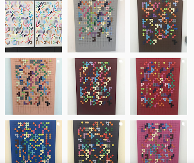
Clarke Reynolds is registered severely sight-impaired and works with braille to educate others at exhibitions and schools. He paints canvas dots using Valspar paint, purchased at B&Q, and arranges them onto a board that he scores and aligns into a graph formation so they read correctly. He sells his pieces to raise money for sight loss charities. I like Clarke's approach to making work. He doesn't come from any artistic background but enjoys being creative. He uses the resources he has available to him, from hardware stores, to make work in his practice. His conducts his own workshops for companies and schools to engage with Braille and the experience of being a visually impaired person during the pandemic. His colourful pieces are impactful and open a line of communication with the sighted audience. His work is relevant to mine as I utilised braille earlier in my project, in a "letters in braille" monoprint series, to portray the language in a different kind of way. My pieces were lo-fi, grungy and oftentimes looked deconstructed. 

Friday, 28 May 2021

[LAUIL603] Studio Brief 2: Tutorial with Matt and Reflection

 Presentation:Notes from Session:

• After discussing all of my ideas, the original idea of blindness is the most compelling to someone who is sighted. I need to consider how to document this. One publication or zine is the most realistic in the time frame I have left - especially as I'm working on all of my modules - rather than a series of zines or publications. Other students have submitted one zine or publication or one piece of work with the proposed intention of continuing to work on it after graduation. It is important not to overwork and overachieve.

• I can say I will continue this exploration after my studies. Could be an exhibition with recorded audio.

• To hit all of the ILOs, I will need to ensure I look at other practitioners whose work is similar to my own. Are other practitioners creating something similar? I looked into this at the beginning of the project and identified a number of disabled and blind artists though find difficulty in connecting with their work as disability is such a particular thing. There are a number of performing artists who are disabled, for example, but their work does not represent me. I found two blind artists whose work is not very personable or representational of being a blind person.

• I could scan paintings in and crop with shapes in Photoshop to achieve the same effect as circular and shaped canvases perhaps? What story would this tell?

• Think of how to marry text and image together and publication themes. Journal/diary entries running through. Other ephemera from the year. Images. How to display text. Crumbling as crumbling text. Collage.

• What do I want to focus on? Tami and the work she carries out? Could show map of Tami going to Uni, Tami's collar, etc. My blindness journey? My mental health? Best to select one and stick with it for one overarching theme.

• Professional Practice is most effective when people talk about their progress from their year and where they will take that next. It isn't about creating business cards or printed ephemera to send out. 


Reflection and Next Steps:

It was nice to catch up with Matt after my absence from the course while Tami had been away with her surgery to remove her tumours. I had a huge breakdown during her 7 month absence, overthought my project and doubted my original intentions that I put forward in the proposal and proposal slides. I originally wanted to centre the project around my experiences of being a blind person, what happened to me and what it means to be blind, and to create a zine or publication in response to that.

With Tami gone I started to paint in response to her absence and how I felt in my isolation as a student totally alone in my accommodation with no friends or family here and wondered if to move the project more towards her, or Guide Dogs in general, or about mental health / isolation / the pandemic to marry with the work I was undertaking in 601 about Art Therapy and art as therapy. While all of these are incredibly important facets to my life, and to my person, it is important to consider what I find value in, what I want to showcase, but to also take on board what others find interesting. To a sighted person - blindness is the most compelling. 

What are my next steps? I'm currently researching and writing my dissertation which is taking up all of my time at present. Then I will focus on PP, finally giving my time to my Final Major Project. I have set deadlines in my mind so that i can hit my targets and daily to-do lists. Working on my own has given me such a great sense of independence and I'm enjoying organising my own time efficiently. I've found something I really love doing with my abstract expressionist paintings, too. There is so much authenticity and worth in every stroke and mark.


Upon documenting this tutorial and reflecting, and once my other module are submitted, I will undertake:

Artist research to have a better understanding of who came before in the abstract expressionist movement. What work did they create? Why? What materials did they use?

Publication research to identify what a zine is and what it can do. What dimensions are most appropriate to me? How many pages should I consider?

• Uploading all of my canvas paintings, rougher and testable paintings and monoprints

• Reflecting on all points

Saturday, 27 March 2021

[LAUIL603] Studio Brief 2: Pre-Easter Reflective Report


Tami finally came home on 23rd March and my mental well-being has instantly picked up as I knew it would do! She is intrinsic to everything in my life. She is the source of my social life, my communication, my familial love, my link to the outside world. She fulfils all of the needs I have and we fit each other like puzzle pieces! We've been a part of each other's lives for 6 years and I can't begin to detail how special a Guide Dog partnership is. It is beyond words. Now that she's been home for a number of days, I'm able to reassess where I'm at in my work after my mental breakdown. 

How is this project going so far? I'm satisfied with my output of canvas paintings before things got bad for me and I started to lose myself in isolation and disconnection. I've completed all three of the briefs I've set for myself though I think I can still continue to experiment with some more paintings of the process of retinal detachment and what blindness means. I don't believe I've quite reached that stage in visual representation. I won't be able to meet any of the deadlines of my peers due to aforementioned personal reasons so will make the time to heal, reflect and push forward. I have lost time because of my mental health, but been afforded time in extensions, but realise I have yet to start planning for and constructing the publication. 

What has worked well so far? Painting onto different canvas shapes has offered the opportunity to problem solve and consider different surface dimensions rather than just square and rectangular. How do I convey the blind lens and how I experience the world, in an abstract way, onto these very small objects? It was often challenging because of how small they were but photographing them and showcasing them onto instagram has achieved a success in my practice. My audience is responding and engaging well with the shaped canvases as they are unusual and not what we usually associate with the word canvas. I only found them when searching thoroughly through Amazon to ensure I'd scoured and scoped every cheap option.

One particular canvas, The First Day, I hold high regard for. I wanted to tell the story of having the membrane peeled from my left eye and what it was like to see through my eye properly for the first time. After grappling with these canvases for some time, getting used to painting and canvases, I managed to accurately portray what it's like to look through a frosted lens with structure gel to create peaks, turrets and warps - using the colours and the hospital room I was staying in to heal.

What could be better? I still haven't had the opportunity to make my own canvas frame yet and stretch the fabric across. This would allow me to work to a bigger scale and would really change my performance, my movement, my visual language and my story telling. Right now I'm using the same dimensions of canvas (8x8, 8x10, 12x16, etc) and shaped canvases (circular, hexagon, triangle) to explore with. I'm sat at my desk and stuck in a way of making. A large canvas could allow me to stand above it, sit next to it, throw paint at it - all of which will change the strokes, the information, and tell a completely different story. I'm not sure if I will have the opportunity to visit the wood workshop for this brief realistically but hope I will find time over the summer as it will be a huge step in my professional practice.

Project development: Looking forward and looking ahead more broadly, I have my dissertation and professional practice to factor in first as I'd like to get those out of the way before I give my full time and attention to my Final Major Project. Writing a dissertation is a terrifying prospect for me. I am not good at academic writing and need to set myself aside plenty of time to grapple this. I have amassed a huge portfolio of paintings and these will continue as I enjoy painting. It excites me and is something I do without needing to gear up and be prompted to do it as it's university work. Once the focus has shifted from the other two modules I would like to continue to explore: further canvas paintings of retinal detachment - continuing to explore with mediums (structure gel, matte medium, gloss medium) to portray blindness.

• To collect all of my photographs from the time from Instagram and my camera roll.

• Exploring poetry to illuminate my blind lens and personal feelings of pain and isolation

• Artist research

• Publication and Zine research

• Reflection on all points to shape and drive the project forward

Friday, 5 March 2021

[LAUIL603] Studio Brief 2: Interim Project Submission and Reflective Report


Important notes to make:

• I haven't submitted anything for the interim submission

• I cancelled my tutorial with Matt as I have reached a terrible place and I think I'm experiencing a mental breakdown.

What are you aiming to achieve in the next three weeks before Easter?

I'm struggling quite a lot at the moment and don't foresee me completing the project in three weeks' time without having a further breakdown than I've had already. I can't get out of bed. I can't eat or clean myself. All I'm doing is existing and painting in my bed and uploading it to Instagram like some kind of reverse John and Yoko. Instead of being in hopelessly in love and at peace, I'm terribly disconnected and empty. I'm no longer living. I'm existing, rotting. I need to step away and take some time to recuperate and heal. I don't know when Tami is coming home and have reached 200 days without her.

Are there aspects of your project you can set aside now?

All of it will have to be set aside for the time being. I find healing and escapism in painting so will continue with that for now while I have the energy to do so. I am creating some of the most authentic pieces I have ever made in my agony.

What are you excited about? Where is the discovery?

It is human to create,. While withstanding difficult circumstances, we discover the most about ourselves in times of adversity. Our most basic components. Who are we when we have taken everything away? My mark making and visual language has changed over the past few paintings while I'm really struggling with isolation and with my mum not doing so well. Her suffering during the lockdown has deeply impacted me and hurt me too. I can't do anything to help her while she is mentally struggling and turning that towards herself and I have my own suffering while I'm without Tami and am so disconnected from the outside world. It's a terrible time.


Hurt and Broken, 2021

What aspect of your work is lacking? Perhaps you need to make more time for crafting, process or additional research?

At this stage, a number of things are lacking and will need to be readdressed at a later time. I need more definitive artist research, publication research, a gathering of content (the painting, poetry, photography, etc) to curate and narrate.

What next? 

Rest. I will need to reach out to student support for some advice and guidance with university when I feel up to it.

Wednesday, 17 February 2021

[LAUIL603] Studio Brief 2: Monoprints and Reflection

The third brief that set for myself was to create a series of monoprints in response to blindness - to attempt to convey blindness and its blurriness using a range of colours and visual language. As with the "Letters in Braille" series. I again used a gelatine plate with acrylic paints to recreate monoprinting at home while the university facilities are closed during the current lockdown.

What excites me about the prospect of monoprinting at home is that anything can happen and anything goes as the paint is rolled out, and each print is created, especially in this set of monoprints without the Braille element. Taking away that aspect, I now didn't know what was going to happen or what to expect. Colours can blend and do anything they wish to. The unpredictability is exciting! I chose my colours at random, as I always do for all of my work, as colours are not important to what I create - but tried to stick with the dark side of the paint box. 

What worked in this brief? There was a varying degree of success with these monoprints. I utilised mark-making exploration as a way to explore my face and face portraiture as a blind person. I would feel my face in congruence with running a brush along the gelatine plate with some interesting visual language being created. The rolling of the paints onto the plate, blending together, successfully conveys blindness in a very dramatic way.

What didn't work? The legibility of the face portraits wasn't as clear as I'd like them to be, which may work in their abstract favour during the experimentation process, but may not hold value towards the final publication. I also didn't check if I was in portrait or landscape orientation before working and the portraits would have worked much better if I'd moved the plate differently so I had more of a surface area to work on. My gelatine (Gelli Plate) is old as it's five years old now, purchased during my time on the Access to HE course, and is unfortunately warped from heat, age, storage, and travelling. This affects the shape of the prints as they aren't perfectly rectangular. Professional monoprints at the university, with professional inks, would have a different visual language and a different quality to them. I could redo these when the facilities are back open but the question remains - when do we come out of the lockdown? Would I want to redo these again?

I need to be mindful of curating the content of my publication/zine and what I want to include in its pages. Is there value and aura to the work produced here because of the lo-fi outcomes? The hand of the maker? Or would higher quality canvas paintings that successfully depict my level of sight have more worth? A mix of both? This is a decision I need to make nearer the time in the development stages of the publication. 

Wednesday, 10 February 2021

[LAUIL603] Studio Brief 2: Letters in Braille Monoprints and Reflection

"Letters in Braille" Monoprint Series:

The second brief I set myself for this project is to produce a series of Braille monoprints and experimentations. I used a Gelli Plate (a gelatine plate) with acrylic paints which allows monoprinting at home, without a press, at a low cost and as an accessible solution to monoprinting while university facilities are closed during the lockdown.

There were varying degrees of success of the braille being legible. Some interesting things happened in the outcomes, with random colour choices and mark making, which were like fireworks and sparks reminiscent of the flashing lights that happen before retinal detachment. Very poignant. Some prints were very grungy in aesthetic and quite deconstructed/deteriorated looking. Lo-fi. These are nice experiments to evidence at this stage though I am not sure how these would sit within a publication and would need to consider and curate my contents when it comes to the making of the publication. What do I want inside? Experimental work? More refined canvas paintings? A mix of both?

What could be done differently or better? My gelli plate is old. I've had it for 5 years now and it is, unfortunately, warped in its shape. It isn't a perfect rectangle and this certainly affects the prints. The Braille didn't pick up as well as I'd hoped and sometimes it's very easy to roll too much acrylic onto the plate and lose information. Some of these things would not happen with professional monoprinting with a press with professional plates and inks. I could consider redoing these when the university facilities are back open.

The Braille is just collected bits of mail that are sent to me in the post - bank statements (thankfully no one can read Braille to read how much money I don't have), newsletters from the RNIB and Henshaws, etc. I don't have access to procuring a Brailler from somewhere like Henshaws or the RNIB at the moment, for a short space of time, because of the lockdown. If i did, there would be incredible value in Brailling my own poetry or my thoughts and creating prints from those. I used to have a Braille which i bought second hand and the money went to a charity in Devon but the problem with Braillers is that they are incredibly fragile and the insider of them need repairing often. 

Saturday, 9 January 2021

[LAUIL603] Studio Brief 2: Timeline of Events

Here is an overview of events to take in consideration for the publication:

4th September 2018 - Change in vision. Like looking through coffee granules sifting in water. Like looking through TV static by the end of the night.

5-6th September 2018 - Further deterioration in vision. Large floaters like black strings across lens, flashing lights, a black curtain pulling across my lens. I needed medical attention. I originally suspected I was exhausted from being a carer to my mum, a stroke survivor, and tending to her needs and two animals, as well as doing all of the house work as well as planning to come back to university and putting those steps in place and packing my things, as well as getting ready to go to a concert and organising everything for that and packing.

6th September - I could no longer ignore what was happening or wish for them to magically get better. I needed help. I don't live near any kind of hospital as I'm on the edge of Salford. I don't have anyone who can drive me anywhere anymore with my mum suffering her severe stroke. She severely disabled and we had to get rid of our car. Waiting for a bus was miserable, but Tami and I went to the Trafford Center where there is a Boots with an opticians. IT's all I could think of doing that was relatively close. 

7th September - Travelling to London for Ghost's Royal Albert Hall show. The black curtain was pulling across my vision so severely and I could barely see a thing. It was a huge struggle checking into the hotel and I didn't even attempt to unpack. That night, I was blind and everything was black.

8th September 2018 - Ghost show (my favourite band) at the Royal Albert Hall in London with meet and greet. The black curtain had completely drawn over my vision meaning that my retina had completely detached and peeled away at this point. I had to stay as safe as possible and ensure I wasn't knocked in any way. Everyone was kind and considerate from the band, crew, and audience. After the show had ended I knew that trains would have stopped running and I'd need to somehow problem-solve what to do next. Someone suggested the Magic Bus service to me. No seats were left and I had to wait for a bus for one available seat next to the driver. I'd travelled alone in the night, with Tami, from London to Manchester and tried to make myself as comfortable as possible. The driver was considerate to my situation and let me know every major city that we passed through. My phone had died upon arriving into Manchester so the next issue was trying to get help in ordering a taxi to the hospital.

9th September 2018 - 7am emergency surgery at Manchester Royal Eye Hospital to reattach my retina.

10th September 2018 - Discharged from Manchester Royal Eye Hospital and sent home with eye drops to help the healing process and the pressure in my eyes. I struggled to use them on my own. My mum is a severe stroke survivor, with little mobility or coordination - especially in her hands, so struggled to help me too.

11th September 2018 - My operated eye was so incredibly swollen, painful and an angry red. It had a tight feeling about it. It didn't feel right to be feeling this way so I ordered a taxi back to the hospital. After going to the eye A&E department, the pressure in my eye was too high and would need operating on. Ideally I would not be awake for this surgery but the nurse received miscommunication about then my surgery was and so I was confused too and gave me something to eat. My eye needed operating on though, so I went under local anaesthetic while I was awake and had needles poked into my eyes. It was like white hot pokers in my eye while the pressure escaped out. It was the worst pain I've ever felty and wouldn't wish it on anybody.

After my second emergency surgery, I stayed in hospital for a number of weeks to help posture my retina correctly and to administer my eye drops at the correct times of the day as I couldn't see to do it as a newly blind person. When my positioning period was satisfactory and over, I could then go home, pack as best as I could and move to student accommodation to start my second year of university. Ideally I wouldn't have been doing this at all given the circumstances but the accommodation were not forgiving of my medical circumstances as I was locked into a contract. I had also the student loans to think about and university and felt a huge amount of pressure to go, and make up for the year I had already taken out to look after my mum.

7th December 2018 - I transferred to St. James in Leeds to have check-ups on my eyes, and it was discovered that the retina was detaching in my other eye while they looked in. Retinal detachment is seen as a medical emergency, even though I was already blind in that eye it still needs attaching. An emergency surgery was booked for the next availability. 

10th December 2018 - Third emergency surgery. The retina had detached differently in my right eye so a silicone buckle had to be inserted into my retina to keep everything in place. At first it wanted to reject and made everything very difficult for me.

5th February 2019 - Fourth and final emergency surgery. A membrane had grown over my left eye which was still preventing me from seeing. Stitches were placed in my eye, instead of the inky gas bubble I'd come to know from my previous 3 surgeries. I really struggled with these stitches and two became very stubborn to dissolve as they became deeply embedded into my eye. 

After being discharged, I didn't feel very well. I got very cold and lost track of time. Guide Dogs had rang me on the phone to make sure I was okay and to see if Tami could come home after my surgery but I was distant and fallen asleep on them. Concerned, they rang my GP. He came to visit and evaluated me. He rang for an ambulance and I was put onto a frailty ward. 

16th February 2019: I had suffered a post-operative infection and had my bloods regularly monitored. 11 days later, I finally go home and heal. I was still suffering with the stitches in my eyes which would send shooting pains down my eyes and face like lava.

March 2019 - April 2019 - Stitches in my eyes were very stubborn but after some prompting with eye drops from my surgeon to speed up the process, were finally dissolved. I had missed the majority of the academic year and needed to reapply. 


Potential content for the zine:

What is a retina? What does it do?

The retina is a layer of cells that line the back wall inside the eye. It senses light and sends signals to the bran to that you can see.


What is retinal detachment?


Retinal detachment is where the retina peels away from its underlying layer of support tissue. It is a surgical emergency and without immediate treatment can lead to vision loss and blindness.


Next Steps:

• Collecting my photographs from my camera roll and compiling into a digital photo album.

•Collecting my instagram posts and statuses of the time. 

• Continuing the physical output/briefs and enjoying the experimentation process.

[LAUIL603] Studio Brief 2: Tutorial with Pat and Reflection

 Notes from Tutorial:

• I discussed the lack of disabled and blind artists in the creative industries and how it was difficult for me to navigate and uncover any blind artists to properly research the work of for this project.

• One such artist, John Bramblitt, came up in my search a number of times and brought up a number of flags for me. He can tell what a colour is by "feeling the paint" - one such news outlet reports. This is misleading and creates all sorts of problems for the blind community. We are not a commodity with this kind of superpower and cannot tell the colour of paints by their thickness. Either this was misquoted or John is fabricating his abilities. This is not what blindness is. While there is a heightened sense of awareness to touch sensitivity, as a means of navigating the world, we don't become a superhero like this and it is dangerous to harbour this kind of thinking. Many blind people also have a small degree of sight, whether that is light perception, colour perception, shadows. Only a tiny percentage see nothing at all.

• Blindness is rarely an issue with the eyes. Something else is happening whether it is the optic nerve or the brain. In my case, it isn't my retinal detachment that caused me to go blind but the complications surrounding it - constant high ocular pressure resulting in early glaucoma, fluid at the back of the eye, and scar tissue.

• How do blind people see colour? There are phone apps and tech devices (Google glasses, Orcam) that can detect colour and say it aloud. We ask people we trust if we are unsure of something and there are apps such as Be My Eyes where we are paired to sighted volunteers in real time. I have used it a number of times for helps with various things such as labels. Thickness of paint is misleading but John has been the first blind painter in many galleries in New York. He paints perfect representations of animals which says nothing about his experiences of blindness. He has some sight to be able to capture these shapes accurately. It's frustrating.

• Do I want my publication to educate the sighted audience reading the contents in the way I have educated Pat? Do I want to reflect on my own experiences and tell that story through text and image? COP work provides a good starting point and foundation of where the publication can go.

• Pat suggests thinking of how to implement and experiment with text. Text could turn to Braille towards the end, disappearing completely to make the audience think and engage about what that could mean for them.


Reflection and Next Steps:

I'm quite nervous at this stage to get started. I have a clear idea of what I would like to do, and that there is a gap in the field of disability for blind artists in order to do it, and on a wider scale in terms of disabled artists, but I feel a pressure to represent myself - and others - accurately and authentically. I think it is important to make a note of that. 

In my COP work, identified in the Project Proposal Slides that were presented during this tutorial, I used very low-cost materials, such as oil pastels and charcoal on paper, to work through the trauma of going blind whilst also trying to represent what I can see. Everything was done in one take and very quickly. I am keen for my final major project to be a continuation of my COP work but I would also like to push myself so I am not stuck in the same ways of creating this year. This is my final year and so I want to utilise the facilities to he best of my abilities despite the lockdown. My New Years Resolution is to paint on canvas.

There is an esteem and a class barrier that surrounds canvas painting so there is another confidence issue I need to work past.

I need to keep myself on track with producing at least two paintings per week during this brief, so that I have a wide portfolio to select from when it comes to creating the publication.

I'm feeling rather down at present. I'm feeling the Festive blues, and I'm still without my Guide Dog and finding it very difficult to engage with the course and with anything at all. Depression has a way of disconnecting you from absolutely everything and you do it without realising. I ignore emails and all messages that are sent to me and cut myself off so I can grieve and try to heal, but ultimately it creates more problems. Tami was due to come home on January 5th but the new lockdown has meant that we cannot retrain until the lockdown is lifted just to be safe. But when will that be? I find little enjoyment in anything except painting so will try to use that to my advantage as much as I possibly can. 

Friday, 8 January 2021

[LAUIL603] Studio Brief 2: First Canvas Paintings and Reflection


The first brief I wanted to set myself was to paint onto canvas for the very first time and to continue this throughout the module so that I have a range of paintings to choose from for my final publication. 

Coming from the Access to HE course, and experiencing a range of disciplines in one place, I had witnessed someone create their own canvas in the 3D/wood workshop and paint it for their final exhibition. I thought no more of it as that didn't align with my practice at the time - someone who wanted to create children's books and had a specific way of achieving that with digital illustration. 

Now that I have reached a way of working that involves abstract expressionism, in a way to heal myself from the trauma I've been through - to create mindfully and in an accessible way - the canvas has become an intriguing option, albeit a scary one!

There is this invisible barrier around the canvas and around oils that has surrounded these materials for many, many years because of gender and class. Oils on canvas are seen as the fundamentals of Fine Art, with associations of high class and high society, the "ivory tower", and are therefor almost untouchable. It was also very much a man's tools where women weren't allowed to go. There are invisible pressures and barriers that I had to mentally work past in order to reach this point and feel like I could paint onto a canvas. While I am not using oils at this stage, partly for monetary reasons, I would like to build up to that one day. For now I am using acrylic paints though have invested in a good quality Liquitex set. I started with a cheap set of readymade canvases from Amazon - flat-backed, without a frame, and easy to be delivered in the pandemic, extremely affordable to my budget as a student and someone from a working class background, and to help me overcome any hangups about painting onto a canvas. If it doesn't work out then I haven't lost out too much and can return to working on textured paper.

I have attempted to convey two elements of blindness onto canvas - high ocular pressure in the first canvas painting and flashing lights before retinal detachment in the second canvas. It was a very strange, yet tactile, experience. Something about it was very physical, very involved... As with anything, this will take some getting used to and more practice to become second-nature and more comfortable.

What could be better? I definitely over-blended in my first canvas painting and some of the strokes and information were lost in the process. I harboured a lot of self-doubt and second guessed every move when I should just let it flow, which is understandable for a very first canvas painting, so ended up with something very naive and juvenile. In the second canvas painting, I didn't gesso the initial surface to see what would happen. I wanted to try using a palette knife for the first time - hitting lots of goals here! This resulted in a very textural painting with very rough and harsh visual language and mark-making. Ultimately, it was incredibly hard to work with as the acrylic paint didn't travel far across the canvas without grounding it first. This will be something to note in the future. Gesso is important!

Thursday, 7 January 2021

[LAUIL603] Studio Brief 2: Project Proposal Slides

[LAUIL603] Studio Brief 2: Project Proposal

My final major project aims to capture my lived experience (from September 2018 onwards) of double retinal detachment as accurately, honestly, and authentically as possible. Through a multidisciplinary approach I aim to make sense of what happened, during a highly traumatic time, to my vision and try to project what I am able to see now. I will take the viewer on a journey through my blind lens.

It is engaging and impactful as, from my research, very little else exists like this in the world that is easily accessible. While disabled artists exist, and to a much lesser extent, blind artists, this kind of work is not readily available to sighted people - let alone that is from the hand of a blind maker. It holds incredible value, personal significance, and aura.

It is relevant to my practice as a blind artist as the double retinal detachment and events surrounding it affected my ability to finish my studies at the time and continue to illustrate in the first instance. It affected every aspect of my life and I needed to rebuild myself and problem solve how I do everything - including making art.

This project will incorporate a series of abstract expressionist paintings to portray my blindness, a direction I have found myself headed in this past year. The new specialist skills I wish to employ for this project include painting onto canvas. I wish to push myself away from painting, albeit naively, on paper and card stock and onto something with more esteem and value that can be exhibited. This will afford me specialist and profession skills upon and beyond graduation.

The strategy I wish to employ for this project are as follows - to adhere to three briefs in an open studio format to allow for experimentation and exploration of the blind lens:

• Brief 1: To paint at least TWO abstract expressionist paintings per week, conveying my blind lens, for the digital publication.

• Brief 2: To produce a series of experimental monoprints, incorporating Braille print.

• Brief 3: To produce a series of experimental monoprints, conveying a blind lens.

• Content: This will be authorial, educational content of lived events. It aims to be innovative and ambitious. 

• Context: Publishing and design. It is relevant at a time when disability is still overlooked and is not at the forefront of representation, when it should be in this day and age.

• Processes: Lens, abstract expressionist painting on canvas, poetry. It is challenging and skilful and aims to push me beyond the foundation I built in the Context of Practice module. 

I am looking to the abstract expressionist field of contemporary practice, drawing inspiration from Jackson Pollock's drip paintings, and other such painters such as Joan Mitchell and Willem de Kooning, to inform the visual language and surface texture of my canvases to give the impression of floaters and decaying sight before detachment.

A potential output will be a digital publication or Zine housing my monoprint experiments, canvas paintings, poetry, photographs, and reflections as a blind person. I want to keep outcomes open at this stage as I have locked myself into a set of definitive outcomes in the past and found it difficult to commit to demanding deliverables. I want to keep it broad to allow for experimentation and surprise. I work best with breathing space where I can enjoy the process of making, and experience the opportunity that painting onto a canvas can afford me - freedom. I will reflect on my progress regularly and monitor next steps in the project.

Tuesday, 5 January 2021

[LAUIL603] Studio Brief 1: Final Reflection

My choice of briefs were well-selected and appropriate to my abilities as an abstract expressionist artist who wants to retain and apply this way of working as much as possible, while also pushing out of my comfort zone through image-making, shape, dimensions, limited colour palette, and moving image.

Electives 2 was truest to my way of working in a very open studio format using a range of methods to problem solve the brief and respond to an appropriate piece of music. What does Salford represent? What are the fundamentals? How can I convey that through texture and colour? With the university facilities closed due to the pandemic and with the November lockdown, I had to work out how to screen print and monoprint at home in a very DIY and homemade way. It deeply embedded and imbued those values of graft that the working class people of Salford, and the wider North, hold dear: giving a greater meaning and connection to the work I was creating.

I found that the greatest surprise was Electives 3, the animated GIF brief. I struggled at first to come up with an idea for a signifier/visual identity/branding/logo and I continued to push it and reduce the shapes and forms. It became very naive and simple, hard to recognise in some instances, but was also a very overdone idea in the rock and metal community. To "throw the horns" is the crux of everything in mental music, created by Ronnie James Dio who is a dear and iconic figure to us, and I tried to do something with it but found that I couldn't quite solve that problem in an image-based way. Taking a different approach through responding to music, staying authentic to how I now make work, offered a much more successful outcome. Identifying and contextualising a font and colour palette gave greater success to this brief.

My ability to problem-solve the briefs in good time, with consideration for limited colour palette, the specifications, and what I find value in - my heritage of Salford, married through my love of music, worked to my advantage. I tried to put music at the heart of all three of the briefs by either responding to music (electives 2 and 3) and including music motifs (electives 1 with the Salford Lads Club - an iconic building in relation to the Smiths - and Joy Division's album cover Unknown Pleasures.)

What could have been different or better? I have realised that I find it incredibly difficult to work to a brief as I don't work in an illustrative mindset anymore. This is no longer my way of working as I no longer identify as an illustrator. I consider myself an artist, or painter, and I work in a very open-mode way. There are still parameters in place in terms of canvas dimensions, the colours I'm using, the song I'm listening to - but anything goes. It's difficult to make this kind of work on a computer. The work I make now is very open and abstract and anything can happen in that one take. The vulnerability and authenticity excites me, rather than planning in a sketchbook as before.

With the animated GIF, I struggled with a successful logo that wasn't a generic fist throwing the horns. I couldn't quite solve that visual problem as it didn't interest me or align with my practice. There was the possibility of being more elaborate and adventurous in the branding through animation but I made it work for my level of vision and my way of working in abstract ways responding to music and the songs on the playlist. The same with Joy Division's Unknown Pleasures for the final stamp in Electives 1. I don't work in an image-based or visual way, I prefer to make abstract work and work through feelings so lost interest in solving the problem. 

Sunday, 3 January 2021

[LAUIL603] Studio Brief 1: Electives 3 - GIF for DJ


Reflection:

What worked well? This brief challenged me a lot and it's often valuable to be pushed out of one's own comfort zone to learn new skills and not settle into a place of complacency. This brief surprised me in what I was able to achieve. I struggled at first to deliver a logo or concept. I wanted to do something with "throwing the horns," which is at the heart of everything rock and metal - but trying different approaching, reducing the shapes, and so on, made it become unreadable. It's also an, admittedly, unoriginal idea that has been overdone in the industry. My greatest success was listening to the playlist and responding to each song individually with charcoal - capturing the sounds through movements which I could then use as individual frames, almost telling a story and narrating the show. 

What could be better? If I had the time, I could have explored the font more and even created my own. I enjoyed making my own font last year in the Dracula brief as I traced around my hands and nails to created claw-like shapes. It was both accessible with my level of vision and successful in being legible. What could I have achieved with more time in this brief? I settled with using a royalty-free version of Iron Maiden's font - one of the most recognisable band logos in the world. It is important to note that this is from dafont.com and is for personal use only, not to be used on any sort of commercial products which should be fine for a small podcast.

Saturday, 2 January 2021

[LAUIL603] Studio Brief 1: Electives 2 - Heritage Space


Reflection:

What worked well? I continued with the starting point from the previous electives brief, creating stamps in response to my heritage, and the identified successful colour palette of green, orange and brown that easily tells the story of Salford's architecture. Another aspect that worked well was the exploration of visual language through texture and how I could interpret rough surfaces, bricks and smoke using brushes and found materials. My ability to push the idea further and problem solve, in response to the pandemic and university's facilities being closed, was also a positive factor. I created my own ways to screen print and mono print at home - reinforcing the values and ethos of the people of Salford - hardworking, dedicated and grafting.

 I much preferred this brief as opposed to the stamp brief. This suits my way of working, in an abstract expressionist and open-most fashion, much more than working to particular specifications. I'm not really an illustrator anymore and prefer to paint and create textures that can be interpreted. 

What could be improved? The university facilities are currently closed due to the lockdown. Testable processes, such as screen printing with proper inks and monopriting with a press, could improve the responses and the visual language within taking them to different, more valuable, places.

Friday, 1 January 2021

[LAUIL603] Studio Brief 1: Electives 1 - Heritage Stamps


Reflection:

For the first electives, I chose to answer the stamps brief. I'm incredibly proud of my heritage of being from a working class background and from a city such as Salford that is rich in music history, art, and graft of the people. 

What went well? Working with a limited and striking colour palette of 3 colours (orange, green and brown - with white) worked incredibly well, and simple shapes of the first two stamps provide easy signifiers of Salford through architecture of the Salford Lads Club and Matchstick Men and Dogs What didn't work? The final stamp was very difficult for me to problem solve of the Unknown Pleasures album cover from Joy Division. I tested two approaches to line - in a scribbly effect and in a thicker, more uniform way, and I'm not sure how successful either are. The album cover is so easily recognisable that to alter the precision of the lines in any way starts to unpick the visual language of what it is and what it says. It no longer becomes easily identifiable as the Joy Division cover and therefor associated with Salford.

In the session with Ben I had started working to another brief, in responding to Dirty Old Town by the Dubliners, and can answer that brief separately in Electives 2.

Monday, 10 August 2020

LAUIL504: Redoing this module

I am greatly displeased at the outcome of the work I've created during this module. My personal life has got in the way, along with self-isolating, and illustrating for a children's book became a huge barrier in itself as undertaking this competition brief has taught me that children's book illustration no longer aligns with my interests. It's no longer something I'm genuinely interested in, like I was in Access  to HE and Level 4, as I've greatly changed as a person by life's trauma and my mental illness. Children's book are no longer a comfort. I tried to rekindle a fire with this module that has truly burnt out.

If I was to do this module again, which I would love to do, I would choose the Secret 7 competition brief and produce a record sleeve for the Foo Fighters song that is available to illustrate for on there. Vinyl has become a great interest of mine so I have plenty of sleeves to contextualise and draw inspiration from. I would look to the Death Metal scene and the printed ephemera surrounding it, created by musicians themselves, to share with a small, niche audience.

Artist Research: Tobias Forge

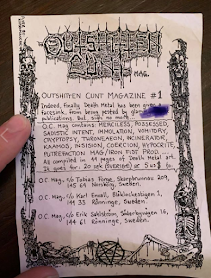
"Outshitten Cunt" zine, issue 1

Tobias Forge is Ghost's frontman and "mastermind" - writing all the music, playing the instruments in the studio recordings and deciding stylistically where he wants to direct his project and how he wants everything to look from merchandise to stage shows. I've already made a post about Ghost on my PP blog and the parodying of Catholicism, but I want to look at Tobias' younger days and his connection to the Death Metal scene in Sweden where he is from.

• Like punk, death metal is a counter-culture / subculture, focusing on the rejection of religion (particularly Christianity and Catholicism), choosing to use imagery of the devil / satan, pentagrams, decrying bodies, skeletons, and foul language to provoke. Death Metal scenes are prevalent in Scandinavian countries like Norway, Finland and Sweden where the Church has a lot of power.

In his youth, Forge was a part of a number of Death metal projects including Superior and Repugnant, where he designed the logos and printed ephemera himself.

• Designing band logos: Each band is easily recognisable by a symbol, an emblem, that can easily be applied to a variety of media. It usually involves a shape or type stylised into a shape which can then be turned into a patch for fans' battle jackets where they display their favourite bands proudly. Forge designed the Ghost logo too. He tends to sketch out the idea using an ink pen before adding shapes and symbols to the lettering to define it.

 • Designing death metal zines. Aura of the hand-made, analogue, lo-fi. Cut, collaged and photocopied together. Black and white, cheap coloured paper. Quick process to produce a large quantity and reach a large audience within a scene to give contact details and band news.


• Zines contain record and gig reviews, information about the band and the members, news updates and contact information to reach the right people

• Tape trading and cassette design - easy to hand out at shows and build a network of connections. Lo-fi and cost effective

• How is this relevant to me and my practice? I've started to enjoy death metal, metal and the subculture surrounding it these past few years and I'm greatly interested in the ephemera created and shared with an audience. I like the element of the hand made, the crafting process, the conservation of constraints and dimensions, and see these as art pieces in themselves.

• As someone who has been letting go of the idea of perfect outcomes these past few years, the distressed and grungy visuals appeal to me ad give these pieces an element of authenticity and ownership. I'd like to create work like this in my practice.

--

If I were to do Studio Brief 2 again, which I would love as I have created no outcomes during a difficult time, I would like to draw up a proposal focusing on mental health and suicide and the idea I have to creat a series of self care cards to use when you are most at risk.

• Self Care cards (creating 6 for the desired number for this brief) to use when feeling suicidal. Shuffle the deck and pick a card to help comfort you during a traumatic time.

Things that have helped me when I feel severely depressed and I can illustrate on the cards:

- Take a shower / perform a self care ritual

- Change your bedding

- Light a candle

- Listen to your favourite song / album

- Reach out to a friend or family member

- Hug your pet

I would look at what exists already in the market and whether this idea is unique. I would look at different decks of tarot cards to help me to understand applied illustration to a small square or rectangle nd how best to use the composition. 

• I would draw from my own experiences