Friday, 20 January 2017

Visual Narratives: Final Paper Cuts and Scanning Horror


• My scanning has been an absolute comedy of errors today! When the library closed at 8, I had to move to the computer room - and in my rush hadn't saved my scans to my memory stick. When I logged into my account they were no longer there on the desktop!

• I scanned everything in again only to discover that now I am back home they were at 50 dpi instead of 300! Argh! This is fine for web use but not for my book - the scans are tiny when dragged into my 200mm x 200mm document!

• I won't be forgetting these any time soon - ALWAYS CHECK I AM SCANNING IN AT 300 DPI. ALWAYS MAKE SURE TO SAVE WORK INTO MY FOLDER BEFORE LOGGING OUT!

• There's always tomorrow to go into college and rescan...

Wednesday, 18 January 2017

Visual Narratives: Hole Punch Art and Cover Rejig


• I'm glad I made the switch to PVA glue and a brush, because holy moly is this precision at its best! Brushing the dots with a fine coat of PVA and then using the brush to help place onto the black card has been a great life-hack and has prevented this task from being any more fiddly than it needs to be!

• Creating these hole punched pieces have truly been a labour of love, time and skill - which is something I wanted to achieve as identified in Louise Lockhart's illustrations. Many times I have wanted to pull my hair out over a hole punched dot going missing or breathing too hard and blowing dots everywhere! I've developed my own technique of arranging the hole punched dots and was going through gluing and placing them quite speedily by the end!

• I'm going through some personal problems at the moment, and this task has been a great difficulty during a hard time - but also a great distraction to take my mind off of the upcoming challenges ahead that I'll have to face. Because of what has happened, I have missed over a day and a half of work because of how anxious, nervous and down the personal situation has made me feel. I'm glad to be back into my project, more determined than ever, to show the person who has tried to belittle and undermine me that they won't stop me from doing what I love; it has taken me 5 years to get to where I am now and I won't be giving it up for anyone!


• The hole punched art allowed to create a much better cover to the one I had before. The rejigged version gives a better sense of symmetry, showcasing the fabulous craftsmanship of my hole punch hole arrangements(!!) and the sewers of the Pearly outfits themselves. I am much, much happier with my character design as well - using a more rounded aesthetic with more angled points. Keeping them as silhouettes works much better as well, instead of digitally painting on the faces. I didn't want to show their outfits here as I feel the cover is already quite busy and full of dots!

• Having my digital print induction this week has presented a lot of new possibilities to me - there was a certain Japanese paper that had pearlescent fibres pressed into one side. It is expensive at £8 a sheet and would need to be specially ordered in - but should I consider using it? Should I print my front and back cover onto acetate to overlay onto the pearly paper?

Tuesday, 17 January 2017

Visual Language: Frame

Frame / Picture Area Handout

• How can we place importance on certain information within the frame?
Importance can be created through consideration of where information is placed within the frame and what size it is given. Choose the size appropriate for the desired effect. Close-ups give an overwhelming, dominant and intimate atmosphere whereas a smaller object is overwhelmed by space giving an isolated atmosphere. Scale will help to give objects a hierarchy of importance for the viewer's eye to follow.

• What are the benefits of overlapping objects in your composition and how is it best achieved?
Overlapping objects will give visual interest to a composition and help to organise objects into varied arrangements. It can help us to express our picture area more directly as the important objects become more prominent while the lesser important ones will be concealed. Information can be relayed this way.

• What role does the frame play in composing visual information within your image? 
The frame is the border, parameter or real estate of the image. Frames and borders can be used to crop or overlap objects, used as a "lead in" to tell the story of the image.

• Can you be critical of the handout in any way?
Rules can be broken and everything in the handout can be questioned because of the time period it was produced in... What is wrong with isolated objects that aren't overlapped? I find them easier to understand with my low vision and having no concealment can make the viewer question which objects are important to them rather than being directed by the artist. What is wrong with lined up objects behind each other? I find that composition quite intriguing, and symmetrical creating a balance, with white space on either side. "Applying common sense to composition" seems like a silly statement to make... 

Critical Task


Here are some of my favourite illustrations from the presentation and critical task...

Image 1 by Dadu Shin: Angular composition; cold colours of muted purple and bluish highlights with one singular eye-catching spot of pink above the figure. Point of interest. Angular shadow draws us down towards the figure. Bottom-heavy composition gives a sense of calm, still and silence. Staring at a wall, waiting for something to happen. Intriguing composition that works well, challenging what the hand-out says about compositional objects falling to the bottom of the image.

Image 2 by Tatsuro Kiuchi: Bottom heavy again, which is a compositional technique I really like. Diagonal lines push the eye down towards the market stall. Broken up into thirds; two thirds red expanse, one third shadowy information. The lighter colours in the bottom third of the image contrast nicely against the intense red in the other two thirds. My eye is drawn to the bottom-right where the shadows dance on the objects.

Image 3 by Tatsuro Kiuchi: Symmetrical! Value and saturation much more prominent in the front of the painting. Warm colours and the most information taking up one third of the image with the other two thirds being cold colours with expanse of area. One singular figure breaks up the symmetry instantly becoming the focus.

Rule of Thirds


Intersections can be used as "hotspots" to put information on to draw the audience into key moments. An interesting device that I will be sure to incorporate!

Practical Task


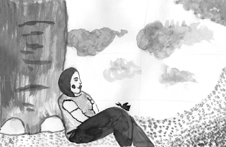
Thought Process: Using the rule of thirds in my roughs, I wanted to ensure that key information was being placed on the hotspots for the eye to be given a sense of satisfaction and places to look. I wanted the relationship between the elephant, butterfly and me to be that of close friendship, trust and community through our interaction of touching and resting. I wanted to place the importance on my upper body resting against the elephant's leg and the butterfly resting on my knee - showing a kindredness. Cropping out the upper part of the elephant and my lower legs helps to "zoom in" on this moment of togetherness. The composition as a whole hopefully reads as friendly, charming and inviting with a marriage of space and detail. I gave consideration to overlapping, viewpoint, negative space, cropping and mark making. The grass swooping upwards to meet the cloud gives a sense of motion in the wind and allows the eye to move around the piece and be drawn back in. I wanted the illustration to be bottom-heavy as that is what I seem to enjoy the most from the examples shown!

Reflection
I'm rather happy with the devices I have learned so far and the opportunity to put them into practice. I think I have done well with executing these techniques in my roughs and giving them deep thought and consideration. I'm relatively pleased with my final outcome but feel it could be improved by perhaps cropping even further to zoom in further on the relationship between the elephant, butterfly and myself. 

Friday, 13 January 2017

Visual Narratives: Paper Cuts


I'm struggling with cut paper a little bit due to my visual impairment: I'm slicing all over the place it seems (I chopped poor pigeon's legs right off and had to reattach them!), and pritt stick, the invisible assassin, is getting all over the place making my work look unprofessional... Would PVA glue be easier to use? I could apply it to the back of my cut paper using a brush... Do the library stock thinner black paper? Would the blue sugar paper in the studio be easier to work with? The paper doesn't necessarily have the be black.

• After cleaning these up in Photoshop, I am really pleased with how they are coming along so don't want to give up on them despite cutting being a struggle for me. I need to keep going! Things aren't meant to be easy and this course is going to be more of a challenge for me more than anyone else, by default.


• After much playing around and experimenting here is a front cover I have created. While I like the paper cut process, the grainy texture, the hand-made fonts and use of silhouettes for simplicity... I don't think I am entirely happy with the characters. They actually look like Beatniks! I'm not sure if I even like the cover as a whole, elements have been simplified too much and nothing makes this cover exciting. I think there needs to be some decoration of buttons to show the flashiness and intricacies of the pearly suits. I need to go back to the drawing board of the character design as well - but I don't want to get too caught up with this aspect!


• I had a quick play around on my Wacom tablet to try and figure out what I want from my aesthetics here, as I'm finding it challenging to properly convey what I want. I would like a softer approach to the characters that can be achieved in a cut paper fashion. Do I need to consider rounder, shorter people to give a jollier visual? The tall, thinner ones aren't giving me a sense of charm and approachability!


• The softer shades of grey from the digital rough above are more appealing to me so I wanted to choose some muted tones. Do I want shades of grey and one or two colours? Would that confuse where the focus of the composition should be?


• While I'm absolutely in love with this aesthetic and the soft pastel colours, I just don't think it marries well with the book I'm wanting to create. I am making it more difficult for myself, as usual, so will stick with a monochrome palette. The thing I want my readers to focus on is the wonder of the Pearly outfits, not a character's cheeks or hair.

Wednesday, 11 January 2017

Visual Narratives: Storyboard and Spreads

Storyboard


This is my thumbnail-sized storyboard of 12 scenes I would like to feature in my book - which will be subject to change at any time. It took a lot of refinement and going through Lorraine Sadler's transcript to pinpoint the special moments in our conversation that I would like to share visually. After speaking with my tutor, he suggested I could have an image over two pages to break it up a little bit and to give the element of surprise when turning the page. This feedback was really valuable and would make my book more visually interesting... I don't need to illustrate each quote!

I'm now considering rearranging:

Page 1: Henry Croft and the costermongers
Page 2 and 3: Designing outfits and each family having own symbol / emblem
Page 4: Cockney Pride and Pearly for each part of London
Page 5: Known for charity
Page 6 and 7: Lambeth Walk
Page 8: Different part to outfit (paper doll)
Page 9: Working Class Royalty
Page 10 and 11: Pearly imitators and button thieves
Page 12: Outfits are part of who we are

Two-Page Spreads


I created my 2 two-page spread mock ups digitally in Photoshop with my Wacom tablet to give an idea of the composition and colours I want to implement. 

Things that work well:
• Textures: I'm really happy with how the overlaid mono prints give a more vintage aesthetic.
• Composition: repeated motifs of the thrones, close up of the hands to zoom right in, zooming back out to show the River Thames. Gives different viewpoints and perspectives and is fun to illustrate!
•Limited colour palette of purple, dusty rose and yellow works particularly nicely.

Things that can be improved:
• General colour scheme is all over the place: need to consider using either black and white to capture the Pearly outfits perfectly and place the focus on them - or a very limited colour palette of black, white and one or two colours.
• Low opacity of the text box makes it hard to see the text: either a full black box or white box would give a more professional look.
• Text boxes need to be in the same place, ideally at the top of the page or the bottom, to give a sense of continuity and like it isn't obstructing the illustration.
• Type: American typewriter font, while giving a vintage aesthetic, feels like it is trying to say something else? Something more simple and rounded such as Helvetica or Gill Sans will give a timeless aesthetic.

Now onto paper cuts!

Thursday, 5 January 2017

Visual Narratives: Illustration Experimentation


Along with testing out monoprinting textures and creating marks, a big aspect I want to make sense of is what aesthetic do I want to achieve in my work? Do I want it to be loose and slightly abstract? Have a tighter cut-paper process with added details of the buttons? A more playful, Ben Javens inspired approach? Is character design something I want to focus on? Is it integral to the story I want to tell?

I need to figure out how to successfully combine elements of both the cut paper process and the more playful character as I like both approaches. I want to create a nostalgic, charming and vintage book effect to give the viewer a sense of a time gone by and traditions from the past.

Artist Research
A downfall of my Visual Skills work was that I looked at too many illustrators for my contextual research and needed to refine my findings a little bit. I got excited by the new work I was uncovering and wanted to create a smorgasbord of it all - which is entirely impossible!


This time around, I want to focus on the illustrators that I know and love and identify the things that make their illustrations successful. What is it that I like about their work? What things can I take to make my own work better?

• Ben Javens: Limited colour palette, adorable, friendly and charming characters. Textured, grainy overlay to create a vintage, printed effect even though his work wasn't created using a printing process.
• Louise Lockhart: Hand-made work, a labour of love. Paper cut process, elements of crafting. Investment of time and skills. Precision but not too caught up on perfection. Modern, digital angle to create something that looks mid-century and sentimental. Evocative.
• Miroslav Sasek: Works he created give a window to the past.  Interesting shapes - angular characters. Pattern and colour. Old brush and paint aesthetic. Whimsical and full of movement

Sasek is a new find for me who I discovered through Amazon over Christmas while searching for vintage children's books to purchase out of my Christmas money. Although I discovered Javens and Lockhart at the beginning of the Visual Skills module and focused on them a little bit during my last submission, I wanted to hone in on them a bit more this time around as their work is truly spectacular and special to me - which is something I want to capture!

Wednesday, 4 January 2017

Visual Language: What is Composition?

Frame, arrangement and the relationship between visual elements.

• What is composition?
Composition is the selection and arrangement of appropriate elements within the picture space - combing forms and space. 

• What can good composition achieve?
Good composition can achieve a harmonious whole, expressing the artist's idea clearly and effectively. It can leave the viewer with a satisfied sense of order and beauty.

• What are the 4 main elements of composition?
Picture area, depth, line (of sight) and value.

• What is the first thing to do when thinking about composition?
The first thing to do is to consider the basic idea I want to get across; the story I want to tell, the effect or mood I am striving to communicate.

• What is the difference between sketching and making artwork?
Sketching is broad and flexible thinking, not concerning itself with details. Rough sketches help to identify the elements in the mind's eye and immediately get ideas onto paper. Artwork is where the problems have been solved and the medium is communicating the message for the final piece.

Mastering composition is one of the most essential skills for an illustrator to learn. It will elevate my work to the next level. I need to consider foreground, mid-ground, background, balance of colours and their value, line of sight (how your eyes read the image and the story is told), negative space, perspective, viewpoint, overlapping of objects and anything else I see, feel or observe.

Initial Thoughts
I struggle with composition sometimes and while it is always something I strive to consider, sometimes without realising it, it isn't something that is always successful in my work. This session has taught me to look at artwork and illustration in a different way and really consider the framing that is being used and why. What story is being told? What feelings are created by the viewpoints?


Eleni Kalorkoti
I really like the monochrome colour palette of this illustration and how the hair / fringe takes up most of the canvas. The eye is immediately drawn to the sharp edge of the scissors as the white blade stands out against the black hair in a very dramatic way. The sparkling eyes are also catching because of the white against black;leading us up towards the scissors because of the direction they are looking. I find it very clever the way it has been deliberately arranged in the rule of thirds; with the bottom third and right-hand side third containing the most information. There is a nice balance between details, shape, form and expanse of black. 


Eleanor Davis
Another image where something takes up most of the frame, but not in an immediate or dramatic way as the previous illustration - largely due to the harmonising combination of warm and softer colours. The handle of the broom leads the eye down into the frame in the direction of the character's head and the window. The wall slopes down to meet the character's shoulder and further down to the sleeve of the shirt on the elbow, tying them into the piece rather than isolating them. The legs frame the secondary character, who is smaller - further away and therefor not as important. My eyes are immediately drawn to the purple pants against the light yellowy green wall - complimentary colours? - which then allows my eye to explore the image and the narrative.


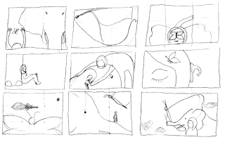
I created a simple story board of 12 frames to tell my favourite movie, Disney Pixar's Brave (2012). This is an extremely beneficial exercise for my Pearly Kings and Queens picture book as I am due to start storyboarding my ideas. I found it actually really, really challenging to condense the movie down into 12 frames as there are multiple subplots in the film - but had to refine my initial list and really consider what is integral to the main storyline. Such a useful exercise on storyboarding, framing and refinement of ideas to tell the most important aspects! 

Practical Task: Elements Painting Challenge

• Figure: Lemur
• Object: Cucumber
• Location: Jail


Reflection
I was unsure of the composition of my first gouache painting - elements were too symmetrical and not as experimental as I would have liked. But if the handout taught me anything, it is to challenge what is written on it. What is wrong with a simplistic, symmetrical image? My second acrylic painting strived to tackle some of my concerns but ultimately became flat and boring - largely, in part, because of the medium I selected of acrylic paints. They didn't quite capture the charming mark making and pattern that I was able to create using gouache. It is interesting to note the thoughts and feelings from each painting because of the medium - where the gouache colours I used had a very warm feel to them they gave an inviting, comforting atmosphere in the prison. Almost funky and jazzy because of the patterned cucumber! The jail cell in the acrylic painting now really captures the loneliness of the lemur longing for the cucumber to eat - instead of gruel! - and the cold, dark and wet environment of an old cell.

I found I had created a lot of roughs as well, because I wanted to play and experiment with this which made it hard to refine a single idea and execute it. I'm still unsure as to whether I picked the most captivating scenarios but it is something to think about for the future!

Tuesday, 3 January 2017

Visual Narratives: Textures


I came into college today, ahead of starting back for the New Year tomorrow, to do some more exploration. I had the studio to myself which was absolute bliss! I experimented with mono printing methods as well as mark-making and textures which I really enjoyed doing in the Visual Language sessions. I used a thick painting brush to create rough marks, the end of a kitchen roll to create circular shapes akin to buttons, found objects and stencils. I used black paint and black ink to convey the black and white outfits of the Pearly Kings and Queens. I photocopied multiples of each so I can experiment with cut paper and collage as well. I have so many techniques I want to try out with these great, handmade textures!

I'm feeling really optimistic about this project and can't wait to get storyboarding and sharing my findings with my peers and tutors!

Sunday, 1 January 2017

Visual Narratives: Interview with Lorraine Sadler- Pearly Queen of Tower Hamlets


I have had the privilege of speaking with Lorraine Sadler, Pearly Queen of Tower Hamlets, for over an hour on the phone today on New Year's Day. It was such a pleasure to speak to someone so selfless, knowledgable and humble! I had originally recorded our conversation so I could type up a transcript and have the audio recording embedded in my blog post - but technology wasn't on my side today, much to my annoyance and despair, so I have had to paste some of the notes I made instead.


• Hi Lorraine! Thank you for giving me your phone number and allowing me to take some of your time on New Year's Day! May I ask how long you have been the Pearly Queen of Tower Hamlets?
"It's absolutely no problem, Kimberley. I'm so glad that you want to learn more about me, my family and our traditions! We are the Official Pearlies and Charity and I always have to make that clear so that people know they are dealing with the real deal. Since I was a little girl I have been involved with being a Pearly. I originate from the original costermongers during Henry Croft's time of 1875, who was the Father of the Pearly tradition as we know it today. It's always been in my family. My Granddad was a London costermonger, or market trader, in the late 1800s and joined with Croft when he decorated his outfit entirely in pearl buttons. They collected money to help the needy and the tradition has passed down since. A big part of being a Pearly is being proud of being a Cockney. You can't be a Pearly if you're not a Cockney... They go hand-in-hand."

• Can I ask about your outfit? Where have the buttons come from and who designs them? Do you design them yourself?
"The pearl buttons are imported from Japan and are very hard to find nowadays. The tradition of having buttons as a Pearly comes from Henry Croft and the costermongers. Costermongers, or market traders, wore buttons from ankle to knee on the outside of their trousers, as well as along the top of their caps and along the pocket flaps. Henry croft saw this and decorated his entire outfit with buttons, which took him 5 years to do, in buttons from the ships that would dock at London from Japan. Many of the buttons I have, have been reused from my mum’s and grandma’s Pearly outfits. Buttons usually are passed on, unless a Pearly chooses to be buried in their outfit instead as my Old Man did. I love sewing so I design my family's outfits - my husband and two girls'. Traditionally a King is supposed sew the buttons onto the outfits but a lot of them don’t! The wives tend to do it for the family. But i love sewing so I don't mind."

• How do you come up with your designs?
"Each family has their own emblem like a dove, heart, horseshoe or anchor, and my family have the flowers. I start each outfit by sewing the name on first 'Pearly Queen / King of Tower Hamlets' which I don't enjoy doing much! I always feel a lot of pressure to get the lettering straight and exact but after that I have fun. I remember when I was ill after my aneurysm and was up late at night sewing buttons - it was a real comfort to me to have something to work towards and keep going. Being partially sighted now has made it harder but I still design everything myself."

• Do you know how many buttons are on your outfit?
"It has to be well over 8,000 on each of the ones I have. I do try to start to count but can never quite get past 1,000! The numbers are always increasing as people give me brooches and buttons to add to my outfits... and I do. I feel like I'm wearing part of them and including them in my charity work. I have various parts to my full outfit - multiple skirts, blouses, jackets and dresses. This is for two reasons: spillages and the fact that the outfits are so delicate and hard to wash. My friend owns a pub and washes his Pearly King clothes in an industrial dish washer! To clean my clothes I have to turn them inside out, gently wash them in the machine and wait for warmer weather to hang them out to dry. A fellow Pearly Queen, and good friend of mine, had a newborn wee on her once! So we quickly learned to have multiple pieces to out clothes. The outfits weigh a tonne. When Dad died he was buried in one of his suits. His coffin was already heavy as he was around 20 stone, but the buttons on his outfit made it even heavier!"

• Do you meet a lot of interesting people?
"The first person who comes to mind, who has stayed with me for many years, is a little boy I visited regularly at Richard House, a children’s hospice, who knew he was going to die. But his spirit was strong and he always showed me the little houses he was carving. There was a certain house he had seen in London and he said, 'I'm going to live in that house one day!' so he carved his own version of it. He was such a character and was always happy to see me. I think about him a lot. Another boy I remember fundraising for so he could go to America to have an operation to help with his Leukemia. It was successful and he lived a good life for about a year or so. We raised thousands and thousand for his operations and it was such an achievement. His family were so grateful. I remember one lady from Nigeria wanted my outfit, then when I explained what I do she wanted me to make her something! I see the same few faces who love following what we do at various events. An American family were in London on their holiday during my Granddaughter’s Christening, and they wanted to take pictures outside of all of us in our Pearly clothes. I sad, “why don’t you come inside and take some better photos?" Every harvest festival a lady from Birmingham comes to see me and it's a delight to catch up with her!"

• Do you get to meet lots of celebrities?
"The first famous person I remember meeting, was when I was my Old Man - he was so well known all over London, I asked him, “Why am I bowing for this lady?” as I didn’t understand. I found out it was the Queen! I thought it was going to be off with my head! My daughter and I have met princess Anne who was a wonderful lady. Truly wonderful. Collectively we've met many celebrities over the years including Tom Jones, David Tennant, Martin Freeman, Lenny Henry, David Hasselhoff, Victoria Wood, Ade Edmonson, and Jools Holland."

• What is the best thing about being a Pearly?
"Helping others, most definitely. That's what it's all about. Our saying is 'One Never Knows', because you never know what's around the corner. Being a Pearly is being a symbol for charity. My family has a purpose and does a lot of good in the community and I'm really proud of the difference we've made. We all have bad days and sometimes I can get really down, but when I’m in my Pearly clothes I put a big smile on my face knowing I’m making other people happy when I’m out and about singing and dancing, raising money for those who need it. One of my fondest memories was being invited to the poppy memorial at the Tower of London, planting a ceramic poppy for those we lost. We raised over £1,000 for the poppy appeal without even setting out to do that. Us Pearlies just showed up in our outfits and people donated very kindly to us. We go to a lot of care homes and it always puts a smile on the old folk's faces when they see in us - it brings back memories of when they were younger and they sing along to the songs. It reminds them of the past. Some even get up to dance to the Lambeth Walk! We were also kindly invited to the London 2012 Olympic Games. We get recognised for our efforts by being awarded in the Queen's Honour List with OBE's and MBE's. My cousin has just been awarded a BEM award for her charitable services in London! We are so proud."


• Are there any downsides to being a Pearly?
"The outfits, as I mentioned, are so heavy and we can only work for a few hours at a time because of the weight of them! People also try to pinch the buttons from my outfit when they're having a photo taken with me - but they should just ask. I would give them one if they want to have one. stealing is against everything we stand for and is so disrespectful. We deal with a lot of imitators who are not Official Pearlies but try to take the Pearly name and image to make money for themselves. I tell them, "You can’t do that! That’s my family’s tradition. We help others, not ourselves." They claim to be the real thing and that they collected with so and so just last week - but it turns out that official Pearly has been dead for some time. It's a shame they try to take something that does a lot of good to meet their own needs. We have an official badge so the public can know who we are. If the Pearly isn't wearing the badge then they aren't official. You can also tell between the real pearlies and the imitators because of our buttons. You can see the difference straight away."

• Have you ever come across anyone with a button phobia?
"Oddly, yes! I've met around 10 people during my time as Pearly Queen of Tower Hamlets. You can see the look of fear in their eyes! I find it a little bit funny, it's an odd phobia to have as buttons are all around us, but I can understand it in a way. They are transfixed by the amount of buttons we wear!"

• What sort of events do you do to raise money?
"We mainly sing and dance in pubs, collecting the money at the end of the evening to give to a specific charity, street collecting, functions and parties with meet and greets, and our biggest event each year is the annual Harvest Festival. On the first Sunday of October we collect on the steps for St. Martin in the Fields where all funds go towards the up-keep of the Church. This is known as our Pearly Church, where we have weddings, christenings and funerals. We come together for Harvest festival and Pearly Remembrance Day - the third Sunday of May, to raise funds. Recently I took part in supporting the Marsden March where people took selfies on marathon days when we were collecting."

• Do you find not many people know who Pearlies are anymore?
"Yes. A lot of Londoners may know the name, or that we have suits of buttons, or the Lambeth Walk and Cockney rhyming slang - but don't know that we are charity workers. American and Chinese tourists, especially, know who we are and always want to take pictures with us. The Costers had a language all of their own, hence the Cockney Rhyming Slang. It was created by crooks of the time so the Police didn’t know what they were referring to. Pearlies are known as Working Class royalty. You may never get to meet royalty itself but we are royalty in the people's eyes because of what we do."

• Do you find it quite fantastic how this whole tradition and culture emerged just because of Henry Croft being inspired by the buttons worn by Costermongers?
"I truly do and it shows the true power and magic of a button! They are not costumes but part of who we are."