Tuesday, 31 January 2017

Visual Communication: Studio Brief 1 - Sound Maps and Initial Ideas


Mind Map
Iterating some of the points I made in my initial briefing post, I wanted to start with a handy mind map just to get some ideas down of instruments used, feelings I have when listening to the songs, imagery that appears in my mind, comments on the tempo, tone, ornamentation, repeated motifs, instruments, arrangements, etc. Mind maps are always a good starting point for me just to build on from simple notes and add more arrows and ideas as they come.

Sound Maps
From the previous module, I found sound maps to be very effective when turning sound into visual representations. Already I am able to see clear differences in the shapes and marks I have used to describe the tone, pace, key and overall feeling in the song. These shapes and marks can be used to create initial character designs!

•  The Lark Ascending has grand, sweeping gestures, intricate swirls representing the high notes, graceful wide shapes, ornamentation of wind and string instruments. I'm thinking of natural, graceful characters with long limbs and charming features. Purposely used a soft pencil, on its side, to capture the softness of the song and the atmosphere it creates.

 • Together (Instrumental) shows a series of repetitive gestures and motions alluding to the electronic, computer-driven sounds that are repeated throughout the song. There is a fluidity alongside a geometric pattern

Waterfall has angular, jagged, unusual and weird shapes making reference to the strangeness of this jazz piece; ranging from high to low notes at random points in the song, warm and comforting feelings to sad and lonely notes from the deep saxophone. There is an organic, jungle-esque feeling with tribal, aztec shapes and motifs appearing.


Initial Ideas
From the shapes and forms in the mind maps I have made a very abstract start on some characters' outlines. I need to keep pushing and iterating as I feel quite uncertain at this stage of where this is going to go... I am not someone who can whack out 20 characters with no thought at all. I need to consider what my intention is with my chosen song of Waterfall by Weather Report. Do I want to capture the strangeness? The unique atmosphere it creates? The jungle-esque mental imagery? Jazz Jungle?! Do I just want to portray jazz for jazz's sake? Jazz is cool!

Monday, 30 January 2017

Visual Communication: Studio Brief 1 - I See Faces


Initial Thoughts During Briefing
I enjoy characters and find them very powerful - the distinctive ones throughout my life have stayed with me through their strong visuals. Matilda, Paddington Bear, Peter Rabbit, Mr. Blobby... All wholly tangible, real and my friends. When a character is designed effectively it really portrays their intentions with immediacy - to be comical, educational, unassuming, thought-provoking...

Designing my own characters is going to be a challenge and it is something I struggled with in my previous project when creating the Pearly Kings and Queens picture book. I got rather stuck at one point, looking to Ben Javens as inspiration while being careful not to imitate him to the point where my own intentions didn't show through. After refinement I was much happier with simplified shapes to represent characters. I am not the kind of person who sits down with their sketchbook and doodles different people and animals with exaggerated features in my spare time - which I think I need to start doing.

I am nervous about creating gifs and animating because of my severe visual impairment - understanding a static image can be hard enough, never mind a moving image! When I go to the cinema I have to use the audio description headsets because movement means flashes of colour, subtitles I can't read and objects moving at a speed that my singular, and very weak, eye cannot keep up with... I am up for challenging myself, I always am, but want to record my anxiousness and hope that is changes as I get stuck into the brief! Have fun! Be experimental! Simplification is amplification!

Three Songs

Weather Report - Waterfall

THOUGHTS: I'm transported into a jungle surrounded by a series of jazzy creatures! There's a slight feel of longing or loneliness but I see splashes of colour and texture on jungle plants and tree bark, vines spiralling and curling outwards, as shadows hide in the lower vegetation.

CONNOTATIONS: It has an organic feeling to the song, there isn't really a sense of 'happy' or 'sad' - upbeat or melancholic - just an organic-ness and naturalness to it. It is very textured, multilayered, changes from higher notes on the saxophone to much lower ones. A deep bass giving a slight kick and twang. It is strange, mysterious, slightly tribal, fluid, hasn't a set composition, but is fascinating.


Ruff Skwad - Together

Thoughts: This wasn't what I expected it would be! I quite enjoy this song after repeated listening and it transports me back to the early 2000's when this flavour of early Grime was prevalent in the UK Top 40, on the television and at people's house parties... The Artful Dodger, Architechs, Sweet Female Attitude and So Solid Crew come to mind! I see the mental image of a lonely character slowly shuffling down the dim street, deep in thought. Contemplating their life in a changing millennium. Possibly texting on their old Nokia 3210 or playing snake, going to a mates' house and refusing to do their maths homework. Am I getting too into this throwback? Probably!

Connotations: Laid-back, downtempo, electronic, mechanical, chilled, repetition / repeated motifs, continuation, funky, urban, youth.


Vaughan Williams - The Lark Ascending

Thoughts: Despite the main image on the YouTube video being of a countryside scene, this is what came to my mind's eye too. I think of nature waking up for Spring after a wistful sleep during the Winter months. Graceful and majestic animals spreading their wings, peeking their long snouts from under their burrow, climbing to the tree tops, splashing from the rivers... Happy to receive the miracle of being alive.

Connotations: Peaceful, majesty, grace, vast landscapes, bird's eye view, sweeping motions, optimismpositivity, grandeur, ornamentation, decoration, warmth. This is a beautiful, charming piece of music, almost like a soundtrack with different suites or narratives in the song, it is very well composed and conventional in a way.


Reflection
What is my own intent for this module? For my time at university? As an illustrator in general? I want to push myself, surprise myself, learn new things, experiment, go out of my comfort zone and be comfortable with making mistakes and growing. The Lark Ascending is probably what I would have chosen right back at the beginning of the course, when I was still very set in my ways of creating images and approaching briefs - but now I want to do something different!

I have chosen Weather Report - Waterfall as it is totally unexpected from me. I want to create some wacky characters like nothing I have done before... I am not really a character artist, I have to admit, and it is something I can get caught up in and struggle with. I am excited at the prospect of filling up a sketchbook in the first week as I mentioned in my end of unit evaluation that I need to get working in my sketchbook more rather than just researching or blogging to solve problems methodically and solve problems visually too.

Tuesday, 24 January 2017

Visual Language: Viewpoint and Depth

• What do we mean by depth in an image? How can this be achieved?
Depth is the illusion of distance and the 3 dimensional plane giving a sense of reality. It can be achieved by overlapping, sizing objects correctly (smaller will be further away, bigger will be closer to us), and arranging within a picture area or frame which may use cropping.

• Is depth only relevant to image makers who want to make 'realistic' artwork?
Not at all! Depth can be seen in anything from cartoons to children's storybooks, that don't want to evoke reality exactly but still want to give a realistic and interesting story to tell visually. The thumbnails in the handout, demonstrating the more realistic works, are reduced to negative shapes or outlines with a more illustrative feel and still give that sense of 3 dimensionality just because of the design theories they are indicating.

• What is line of sight?
Line of sight refers to the direction our eyes are taken when viewing an image, purposely imposed by an artist or designer so that we uncover the story in a certain way.

• What does line of sight do for your composition?
Line of sight can control where the viewers' eyes move to read the story and the centre of interest in the composition as a whole. The type of movement can also be conveyed.

• How does movement relate to line of sight?
Movement relates to line of sight through directional line; either moving us along smoothly and rhythmically or abrupt with a clash of lines. The movement will lead the eye but also give the atmosphere and feeling the artist wants the viewer to experience. Tangents will lead the eye away so lines must be moved away from each other to lead into the interesting area.


Critical Task


Image 1 by Laura Carlin: I love, love, love Laura Carlin and find this to be a really nice illustration - full of character and charm! The main focal point is the large sculpture to the left which fills the majority of the canvas and gives a sense of foreground. The mid ground and background are littered with figure sculptures getting smaller in size, giving a sense of depth and distance. These become darker as they enter the shadows. The viewpoint is rather strange, I feel, as I seem to be floating above and looking down on the sculptures, from the way I can see the plinths clearly. The background shows we are in a dark forest with a full moon, stars and trees - so this particular viewpoint matches the surreal and dreamlike scenario. A graveyard perhaps? There's lots of texture which becomes more prominent as the figures move into the distance. My line of sight, however, starts with the peachy-pink figure to the right and then moves to the larger white sculpture. Having a warmer colour surrounded by darker background helps to bring it out to my attention more so than the larger figure.

Image 2 by Miroslav Sasek: I absolutely love the whimsical work of Sasek and referenced him a lot when making my Pearly Kings & Queens picture book. This illustration is so full of movement; perfect for an underground station which buzzes with activity. The clever sweeping gesture of the tracks leads the eye up to the middle, just off centre, to meet the domed roof which graduated spirals outward to envelope the picture area. The walls are curved, bringing the viewer into the picture. There is just the right balance of black and white versus colour and depth is portrayed well through the use of perspective and objects going smaller into the distance. The line of sight goes straight to the centre-right where the track leads up to the curved ceiling, with the eye then exploring outwards to read the narrative.

Image 3 by Mobius: I really enjoy the different viewpoint shown here, through a bird's eye view to show the sweeping motion of the large bird - which is the main focal point, just off centre to the left. The wing pointing to the right leads the eye towards the smaller boats just above the waterfall. The larger cliff faces in the foreground pull the image together giving depth and distance as well as an 'S' shape - giving visual interest to composition, rather than the picture just being head-on. In terms of value and colour, the blue is much more saturated at the front and fades to white the further away it goes.

Practical Task: Over There!


I knew the perfect place to go for this task - the Blenheim Walk boardroom! As Student Governor, I spend a lot of time in here attending both Board of Governors' meetings and Learning Teaching Enhancement meetings. It has big wide windows to look out of and I knew I wouldn't be distracted by other students doing the same task. It was warm and cosy and I was treated to a cup of sweet coffee and the radio switched on to high capacity by one of the members of the Senior Management Team. Awesome!


Here are my initial roughs and sketches from my photographs giving consideration to angles, overlapping of objects pointing to a certain direction, depth, perspective and viewpoint - leading the eye to different areas to unveil the narrative. I toyed with the idea of including my pencil case, coffee mug, window edges and Guide Dog somehow in the final piece...


Process: 
• I cropped the final version quite a few times on the guillotine to draw the viewer in even more than I had originally planned and give more focus to the central elements.
• I gave consideration to perspective and wanted to show my view from the first level; slightly from above but not too high above at a bird's eye view level.
• I used varying strengths of ink and a big brush so it could convey the rainy day, and allowed the ink to be loose and splatter as much as it wanted to to provide extra narrative.
• I used darker ink in the foreground and gradually watered it down in the background. This gives a really foggy, misty aesthetic which I really like and mirrors the fogginess on the window I looked out of. It is also an excellent device for giving depth.

Reflection:
• If I had more time, I would have liked to print this out in multiple layers and turned it into a clearer diorama of sorts - just to give the illustration more of a three-dimensional look. It did adhere to the brief of having multiple layers placed onto another. Would it have been better as a three dimensional piece supported by a paper frame?
• Adding Tami was an after-thought to give the illustration a little bit of whimsy and narrative (as she was snoring on my foot when I was prepping my roughs in the Boardroom!) and my peers responded to it really well. In hind-sight, I feel it may be a bit of a distraction to the overall piece? Would it have been best to leave it out?

Saturday, 21 January 2017

Visual Narratives: Final Outcome


http://issuu.com/kimberleyburrows/docs/book_de7e8dc166ce39?e=27645439/43661283

Here is my final book! I am so pleased with how it has turned out. It isn't perfect, by any means, but it has allowed me to challenge myself out of my comfort zone and really get to grips with cut paper and InDesign - two things I really wanted to tackle. On reflection, I think I have had a lot of successes during this module, despite personal problems away from the course, and am proud of my planning, thorough research, organisation and determination to keep going and pushing ideas - no longer accepting the first idea and the first rough. I can reflect more on my end of module evaluation sheet but wanted to jot down a few initial thoughts!

Friday, 20 January 2017

Visual Narratives: Final Paper Cuts and Scanning Horror


• My scanning has been an absolute comedy of errors today! When the library closed at 8, I had to move to the computer room - and in my rush hadn't saved my scans to my memory stick. When I logged into my account they were no longer there on the desktop!

• I scanned everything in again only to discover that now I am back home they were at 50 dpi instead of 300! Argh! This is fine for web use but not for my book - the scans are tiny when dragged into my 200mm x 200mm document!

• I won't be forgetting these any time soon - ALWAYS CHECK I AM SCANNING IN AT 300 DPI. ALWAYS MAKE SURE TO SAVE WORK INTO MY FOLDER BEFORE LOGGING OUT!

• There's always tomorrow to go into college and rescan...

Wednesday, 18 January 2017

Visual Narratives: Hole Punch Art and Cover Rejig


• I'm glad I made the switch to PVA glue and a brush, because holy moly is this precision at its best! Brushing the dots with a fine coat of PVA and then using the brush to help place onto the black card has been a great life-hack and has prevented this task from being any more fiddly than it needs to be!

• Creating these hole punched pieces have truly been a labour of love, time and skill - which is something I wanted to achieve as identified in Louise Lockhart's illustrations. Many times I have wanted to pull my hair out over a hole punched dot going missing or breathing too hard and blowing dots everywhere! I've developed my own technique of arranging the hole punched dots and was going through gluing and placing them quite speedily by the end!

• I'm going through some personal problems at the moment, and this task has been a great difficulty during a hard time - but also a great distraction to take my mind off of the upcoming challenges ahead that I'll have to face. Because of what has happened, I have missed over a day and a half of work because of how anxious, nervous and down the personal situation has made me feel. I'm glad to be back into my project, more determined than ever, to show the person who has tried to belittle and undermine me that they won't stop me from doing what I love; it has taken me 5 years to get to where I am now and I won't be giving it up for anyone!


• The hole punched art allowed to create a much better cover to the one I had before. The rejigged version gives a better sense of symmetry, showcasing the fabulous craftsmanship of my hole punch hole arrangements(!!) and the sewers of the Pearly outfits themselves. I am much, much happier with my character design as well - using a more rounded aesthetic with more angled points. Keeping them as silhouettes works much better as well, instead of digitally painting on the faces. I didn't want to show their outfits here as I feel the cover is already quite busy and full of dots!

• Having my digital print induction this week has presented a lot of new possibilities to me - there was a certain Japanese paper that had pearlescent fibres pressed into one side. It is expensive at £8 a sheet and would need to be specially ordered in - but should I consider using it? Should I print my front and back cover onto acetate to overlay onto the pearly paper?

Tuesday, 17 January 2017

Visual Language: Frame

Frame / Picture Area Handout

• How can we place importance on certain information within the frame?
Importance can be created through consideration of where information is placed within the frame and what size it is given. Choose the size appropriate for the desired effect. Close-ups give an overwhelming, dominant and intimate atmosphere whereas a smaller object is overwhelmed by space giving an isolated atmosphere. Scale will help to give objects a hierarchy of importance for the viewer's eye to follow.

• What are the benefits of overlapping objects in your composition and how is it best achieved?
Overlapping objects will give visual interest to a composition and help to organise objects into varied arrangements. It can help us to express our picture area more directly as the important objects become more prominent while the lesser important ones will be concealed. Information can be relayed this way.

• What role does the frame play in composing visual information within your image? 
The frame is the border, parameter or real estate of the image. Frames and borders can be used to crop or overlap objects, used as a "lead in" to tell the story of the image.

• Can you be critical of the handout in any way?
Rules can be broken and everything in the handout can be questioned because of the time period it was produced in... What is wrong with isolated objects that aren't overlapped? I find them easier to understand with my low vision and having no concealment can make the viewer question which objects are important to them rather than being directed by the artist. What is wrong with lined up objects behind each other? I find that composition quite intriguing, and symmetrical creating a balance, with white space on either side. "Applying common sense to composition" seems like a silly statement to make... 

Critical Task


Here are some of my favourite illustrations from the presentation and critical task...

Image 1 by Dadu Shin: Angular composition; cold colours of muted purple and bluish highlights with one singular eye-catching spot of pink above the figure. Point of interest. Angular shadow draws us down towards the figure. Bottom-heavy composition gives a sense of calm, still and silence. Staring at a wall, waiting for something to happen. Intriguing composition that works well, challenging what the hand-out says about compositional objects falling to the bottom of the image.

Image 2 by Tatsuro Kiuchi: Bottom heavy again, which is a compositional technique I really like. Diagonal lines push the eye down towards the market stall. Broken up into thirds; two thirds red expanse, one third shadowy information. The lighter colours in the bottom third of the image contrast nicely against the intense red in the other two thirds. My eye is drawn to the bottom-right where the shadows dance on the objects.

Image 3 by Tatsuro Kiuchi: Symmetrical! Value and saturation much more prominent in the front of the painting. Warm colours and the most information taking up one third of the image with the other two thirds being cold colours with expanse of area. One singular figure breaks up the symmetry instantly becoming the focus.

Rule of Thirds


Intersections can be used as "hotspots" to put information on to draw the audience into key moments. An interesting device that I will be sure to incorporate!

Practical Task
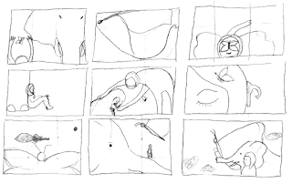

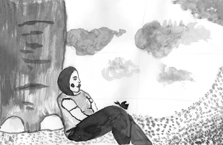
Thought Process: Using the rule of thirds in my roughs, I wanted to ensure that key information was being placed on the hotspots for the eye to be given a sense of satisfaction and places to look. I wanted the relationship between the elephant, butterfly and me to be that of close friendship, trust and community through our interaction of touching and resting. I wanted to place the importance on my upper body resting against the elephant's leg and the butterfly resting on my knee - showing a kindredness. Cropping out the upper part of the elephant and my lower legs helps to "zoom in" on this moment of togetherness. The composition as a whole hopefully reads as friendly, charming and inviting with a marriage of space and detail. I gave consideration to overlapping, viewpoint, negative space, cropping and mark making. The grass swooping upwards to meet the cloud gives a sense of motion in the wind and allows the eye to move around the piece and be drawn back in. I wanted the illustration to be bottom-heavy as that is what I seem to enjoy the most from the examples shown!

Reflection
I'm rather happy with the devices I have learned so far and the opportunity to put them into practice. I think I have done well with executing these techniques in my roughs and giving them deep thought and consideration. I'm relatively pleased with my final outcome but feel it could be improved by perhaps cropping even further to zoom in further on the relationship between the elephant, butterfly and myself. 

Friday, 13 January 2017

Visual Narratives: Paper Cuts


I'm struggling with cut paper a little bit due to my visual impairment: I'm slicing all over the place it seems (I chopped poor pigeon's legs right off and had to reattach them!), and pritt stick, the invisible assassin, is getting all over the place making my work look unprofessional... Would PVA glue be easier to use? I could apply it to the back of my cut paper using a brush... Do the library stock thinner black paper? Would the blue sugar paper in the studio be easier to work with? The paper doesn't necessarily have the be black.

• After cleaning these up in Photoshop, I am really pleased with how they are coming along so don't want to give up on them despite cutting being a struggle for me. I need to keep going! Things aren't meant to be easy and this course is going to be more of a challenge for me more than anyone else, by default.


• After much playing around and experimenting here is a front cover I have created. While I like the paper cut process, the grainy texture, the hand-made fonts and use of silhouettes for simplicity... I don't think I am entirely happy with the characters. They actually look like Beatniks! I'm not sure if I even like the cover as a whole, elements have been simplified too much and nothing makes this cover exciting. I think there needs to be some decoration of buttons to show the flashiness and intricacies of the pearly suits. I need to go back to the drawing board of the character design as well - but I don't want to get too caught up with this aspect!


• I had a quick play around on my Wacom tablet to try and figure out what I want from my aesthetics here, as I'm finding it challenging to properly convey what I want. I would like a softer approach to the characters that can be achieved in a cut paper fashion. Do I need to consider rounder, shorter people to give a jollier visual? The tall, thinner ones aren't giving me a sense of charm and approachability!


• The softer shades of grey from the digital rough above are more appealing to me so I wanted to choose some muted tones. Do I want shades of grey and one or two colours? Would that confuse where the focus of the composition should be?


• While I'm absolutely in love with this aesthetic and the soft pastel colours, I just don't think it marries well with the book I'm wanting to create. I am making it more difficult for myself, as usual, so will stick with a monochrome palette. The thing I want my readers to focus on is the wonder of the Pearly outfits, not a character's cheeks or hair.